Filed under: events, graphic novels, illustration, my antarctica, picturebooks | Tags: antarctica, art, books, cartoons, children's books, comics, drawing, graphic novels, illustration, travel, travel book, travel diary, travel journal, travel sketchbook
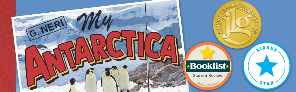
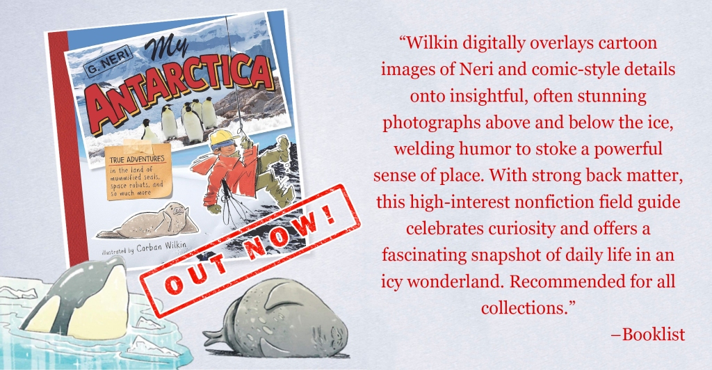
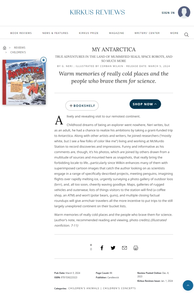
My Antarctica is out today from Candlewick Press and I’m thrilled to announce that not only has it received the prestigious starred review from Kirkus, but also from Booklist, and to top it all has been chosen as a Junior Library Guild Selection.
Thank you to all the people who’ve taken the time to write about this book, including Publishers Weekly, the School Library Journal, and the Bulletin of the Center for Children’s Books.
Written by G. Neri and illustrated by myself, the book takes a modern, personal, and humorous journey into our most mysterious continent.
It’s been a long time coming, and it’s exciting to see this travel-journal-picturebook-graphic-novel finally hit the shelves.
You can find all the places to order your copy on my website or at Penguin Random House.
Filed under: drawing, drawing theory, events, illustration, my antarctica, picturebooks, sketchbook, south africa | Tags: art, books, children's books, creative talks, drawing, illustration, picture books, sketch, south africa, writing, writing seminar
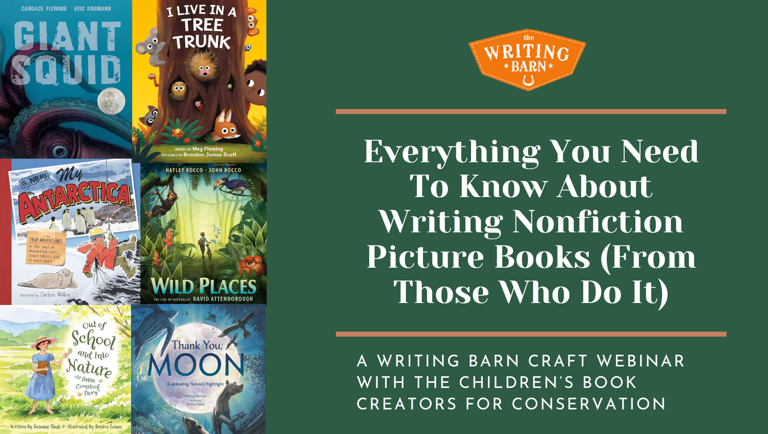
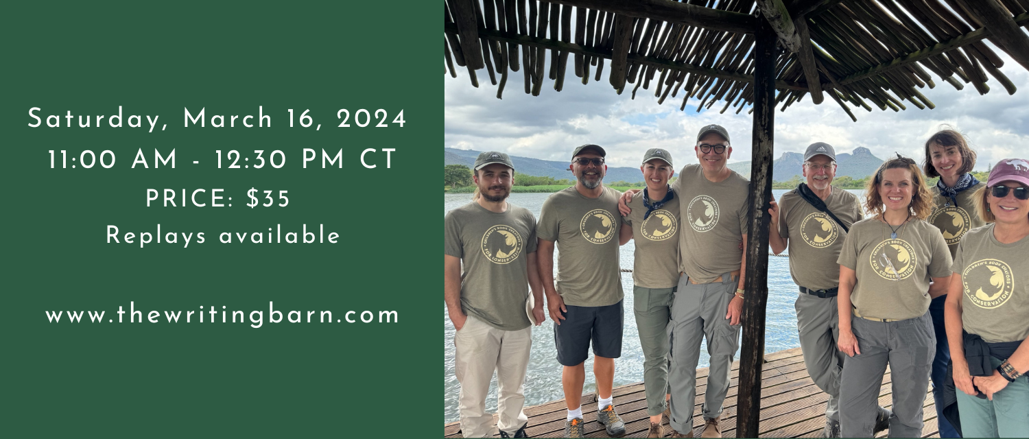
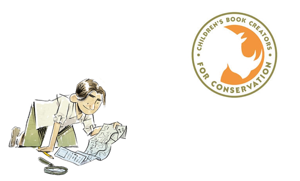
This March 16th I have the immense honour of speaking alongside six truly great children’s book creators in The Writing Barn’s online seminar about nonfiction picture books.
I’ll be speaking on the topic “Making Room for the Illustrator” and touching upon real-world visual research and how illustration can contribute to nonfiction storytelling.
Here is a one-time opportunity to learn new ideas, methods and approaches to creating nonfiction picture books from seven of the most successful book creators in publishing AND help save South Africa’s wildlife at the same time. In this fast and fun, 90 minute event we will cover every facet of the creation process from research and ideas to creating and selling your book. Above all, you will discover how to take known facts and transform them into a true story that is uniquely yours — exactly what agents and editors are searching for.
Led by the amazing group Children’s Book Creators for Conservation, this webinar will be full of unique insights and take aways. This is a charity event with $30 of your registration fee going directly to Wild Tomorrow, a nonprofit working to restore wildlife and wild places in South Africa.
Sign up for the online event here.
Filed under: comics, events, graphic novels, writing | Tags: art, books, cartoons, comics, drawing, graphic novels, illustration, writing
Filed under: illustration, my antarctica, picturebooks | Tags: art, books, cartoons, children's books, drawing, graphic novels, illustration, illustrations, picture book, picturebook, travel book, travel diary, travel journal
My Antarctica has just been chosen as one of Kirkus Reviews’ most anticipated books of 2024 and given its first review. Thanks!
Filed under: comics, drawing, graphic novels, writing | Tags: art, awards, book-review, books, comics, fiction, graphic novels, illustration, news, writing
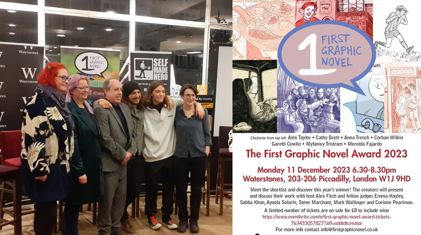
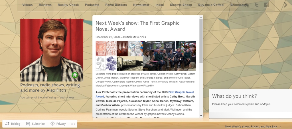
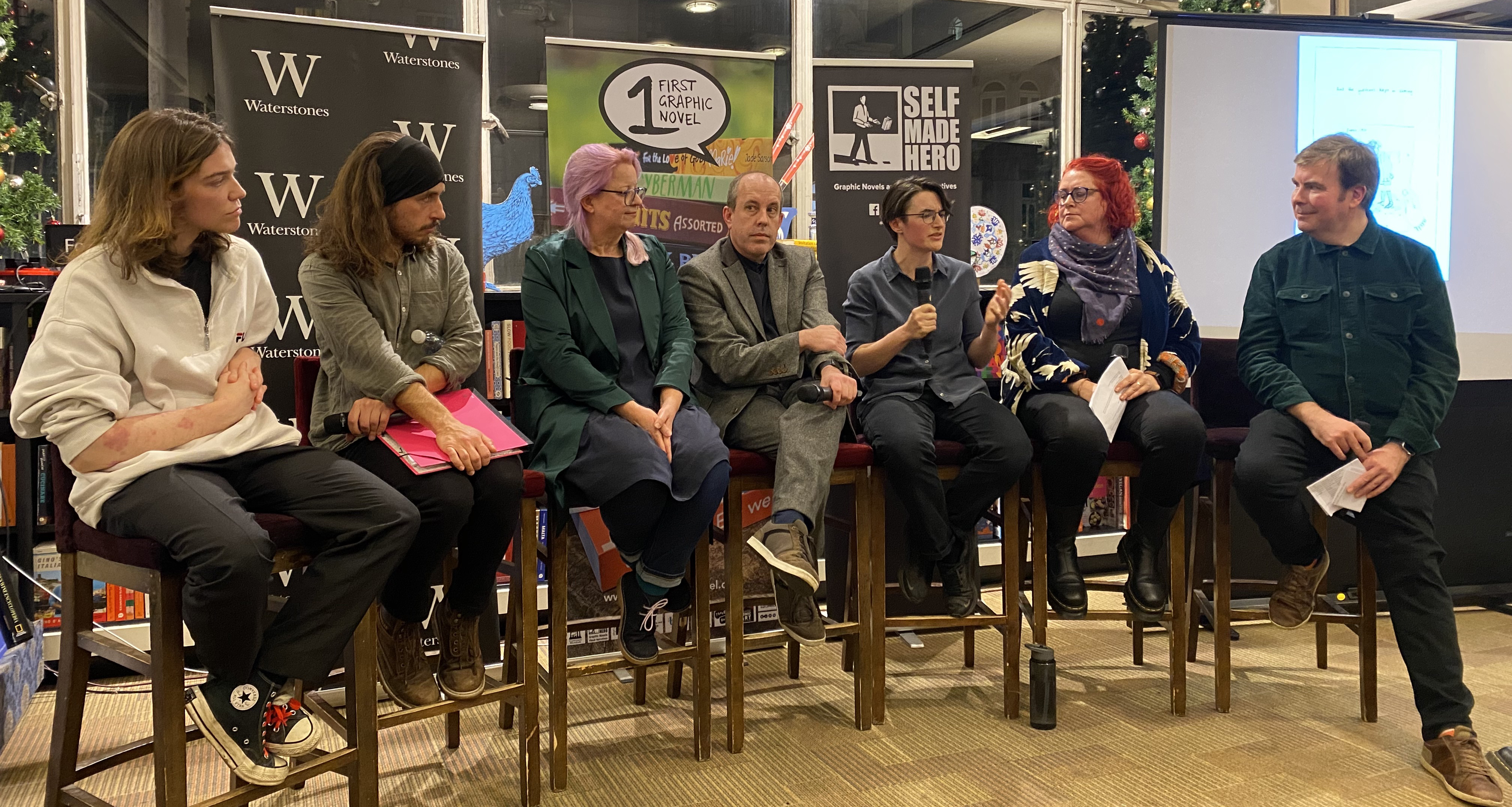
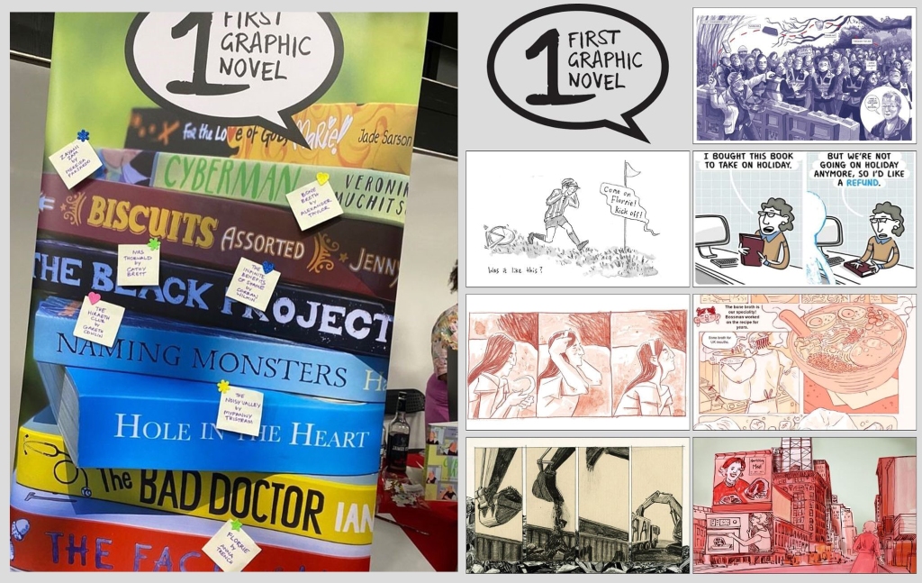
On Monday I had the immense honour of being invited to Waterstones Piccadilly to speak alongside the six other shortlisters for the First Graphic Novel Award on a panel hosted by the inimitable Alex Fitch of Panel Borders, who asked us some pretty challenging and revealing questions about our shortlisted graphic novels.
The insights my fellow shortlisters gave about their books showed how deeply and carefully they have thought about their work and proved once again the wealth of talented, intelligent people who are putting immense amounts of their own time and effort into this complex artform.
After the creators spoke, the seven judges for the award spoke each in turn about one entrant’s work. My entry, The Infinite Benefits of Shame, was addressed with the most incredible care and detail by Ayoola Solarin, for whose words of understanding I am more grateful than I could have imagined.
The award was given to Bone Broth, by the amazingly talented Alex Taylor (azbtart), with whose precocious artistic skill I’ve no doubt will produce a finished book more than worthy of this award. However, I think I speak for all of us when I say that as the seven shortlisters, we were just very lucky to be up there out of 170 entrants to the award.
As I grow older, and especially after hearing the kind and thoughtful words of the judges and other entrants, I’m realising more and more that the point of all this is not selling a book or winning an award: the point is to communicate. I’ve written recently in this journal about how I’m not always as good at meeting and getting to know people as much as I wish I could be. The only reason I write and draw is out of a kind of yearning to communicate, to articulate something that I am trying to understand about myself. I’ve always hoped that by finding a way to share this stuff, there would be people who would be able to read it and feel understood.
All my most profound experiences of art have involved the feeling of being totally understood by the author or artist whose work I’m experiencing. To see articulated by total strangers, in words or images, your own deepest feelings, things which you have not even understood yourself, is the pure magic of art. Our favourite artists seem to understand us more than the people we see every day. And to know that artists sacrifice everything to journey into their own underworld to find this understanding and offer it to the world is what drives me to continue trying my best to do the same.
Gaining a deeper insight into my own motivations for doing this, and experiencing the validation of being championed as one of the final seven, is a reward as great as any win, and I can only humbly thank you all one last time for the work of putting it together.
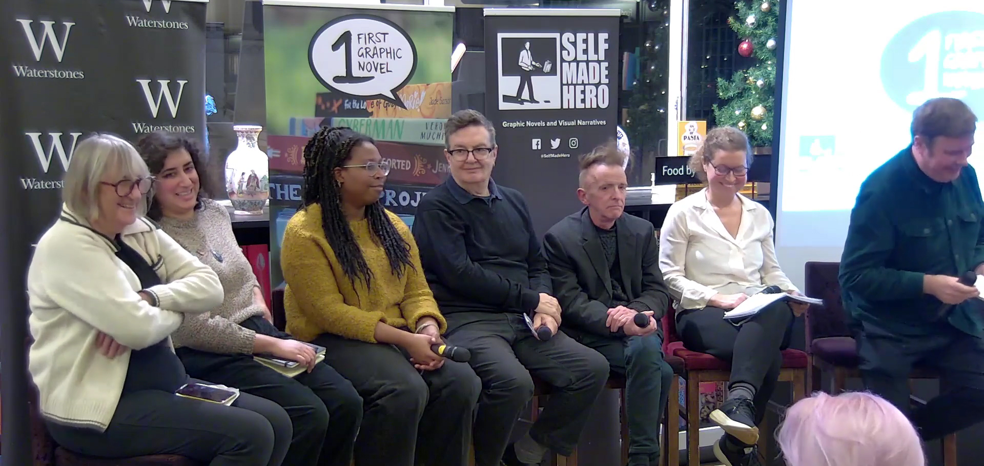
Thank you Corinne Pearlman, without whom the award would not exist; Emma Hayley, who has invited me along to many cool things over the years; Sabba Khan, who welcomed me so warmly to the event; Mark Wallinger: an unbelievable privilege to have him reading our work; Steve Marchant, who has already taught me and many others so much; Alex Fitch, for his world-class panel-hosting skills; and once again Ayoola Solarin for her support for my entry, which means everything.
Also thank you to James Spackman and the BKS agency, the ALCS, The Cartoon Museum, SelfMadeHero, BBC Radio 4’s Front Row, and to Waterstones for hosting the event! This is all so much more than I deserve and I can’t really express how grateful how I feel. And congratulations once more to the star of the event, Alex Taylor!
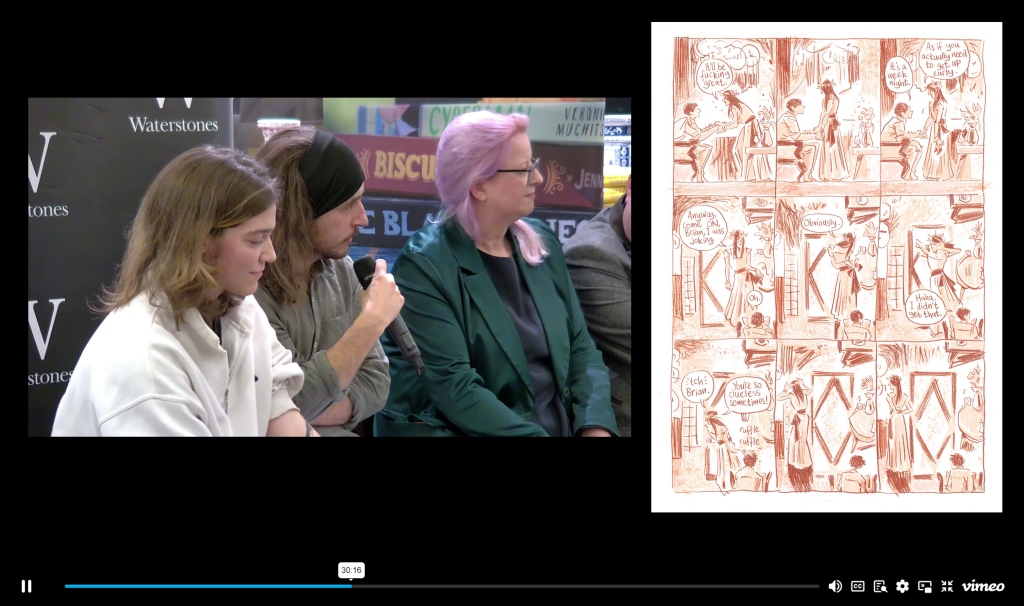
The event was a blur of nerves and excitement, but fortunately you can watch the whole thing on Vimeo.
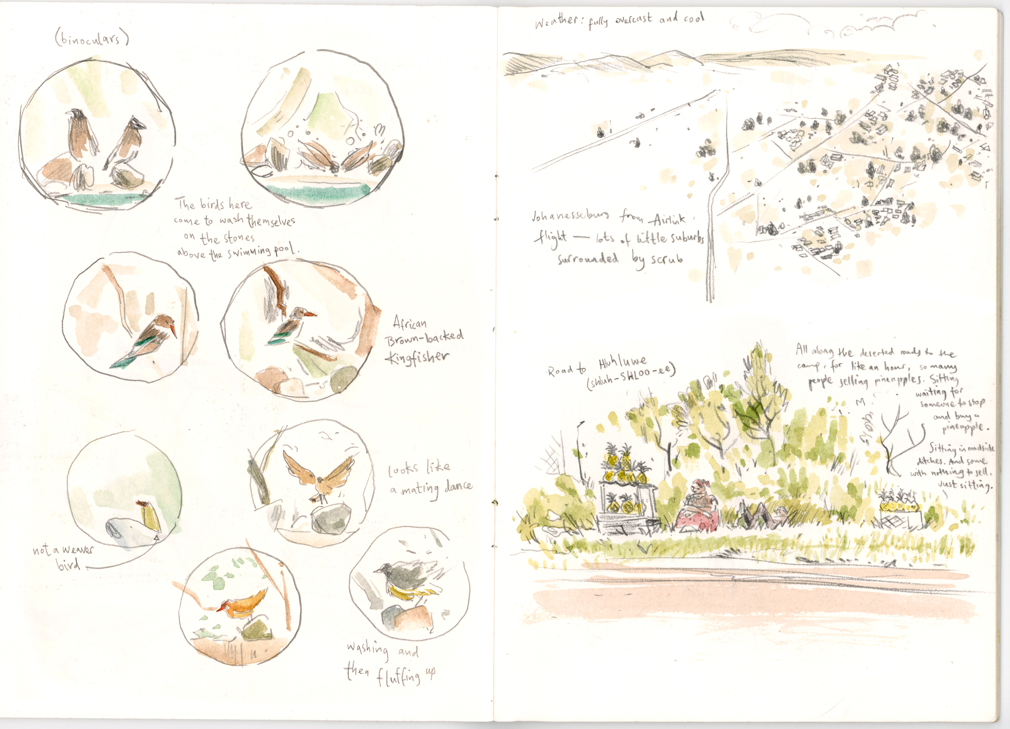
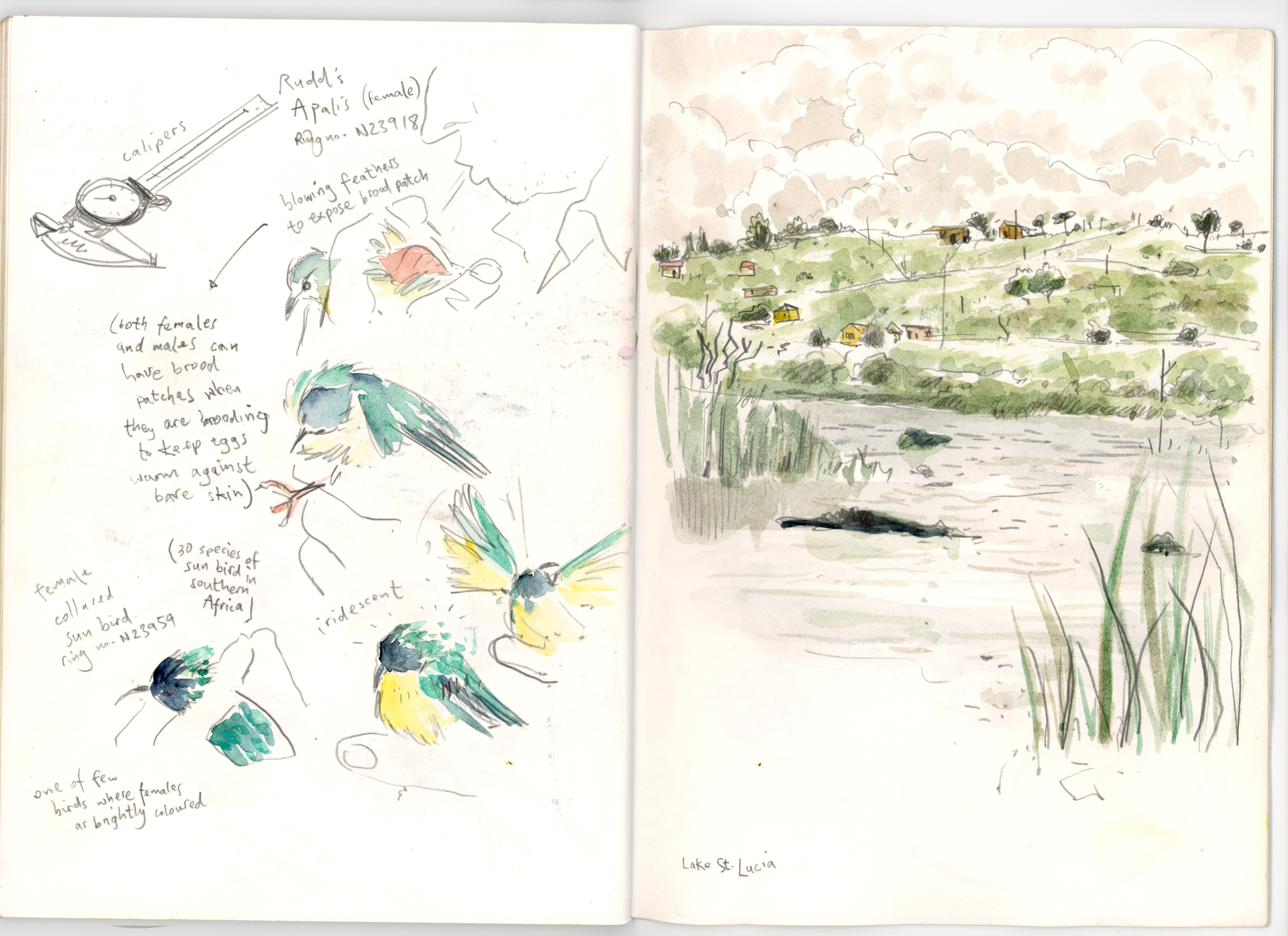
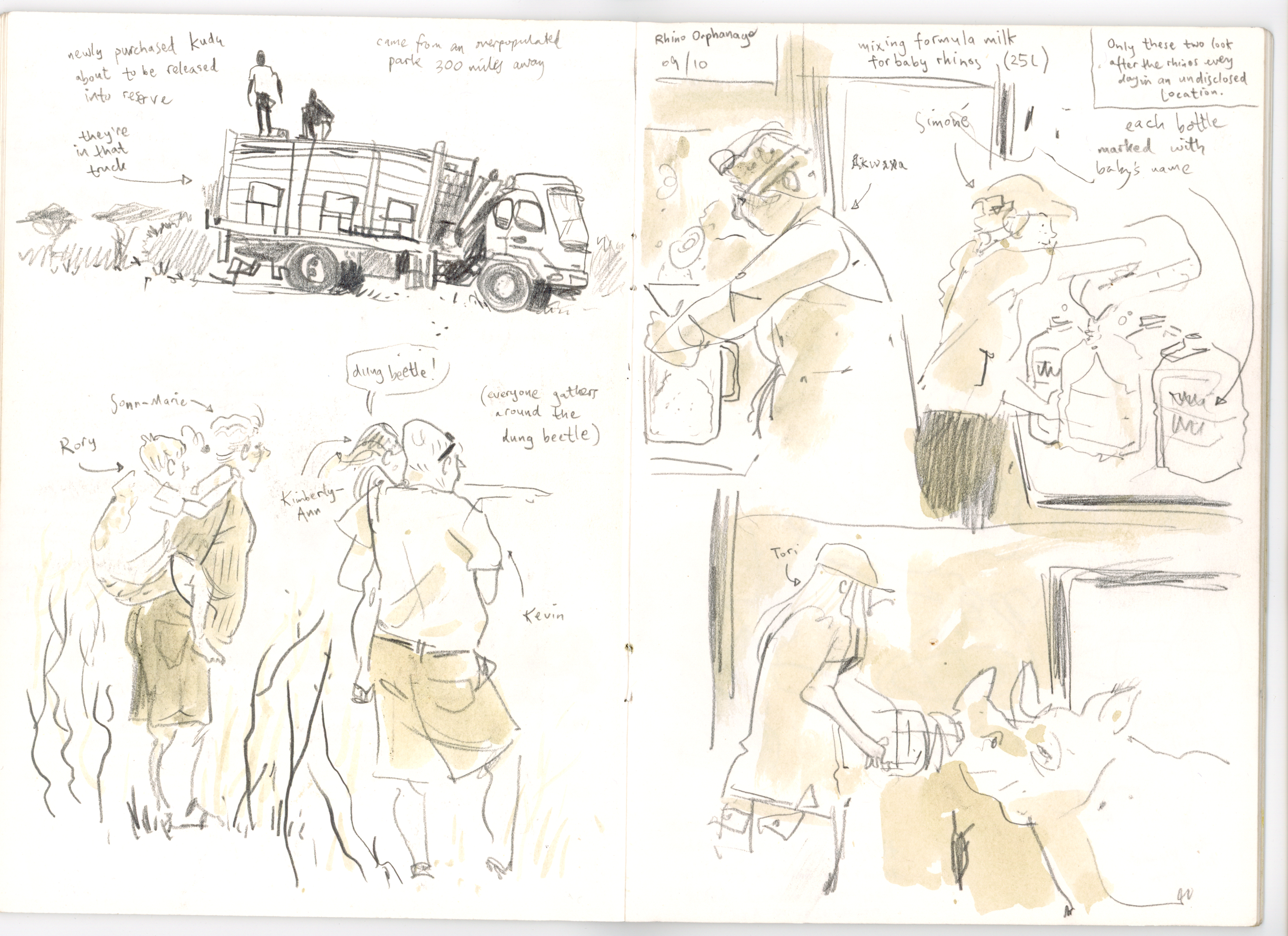
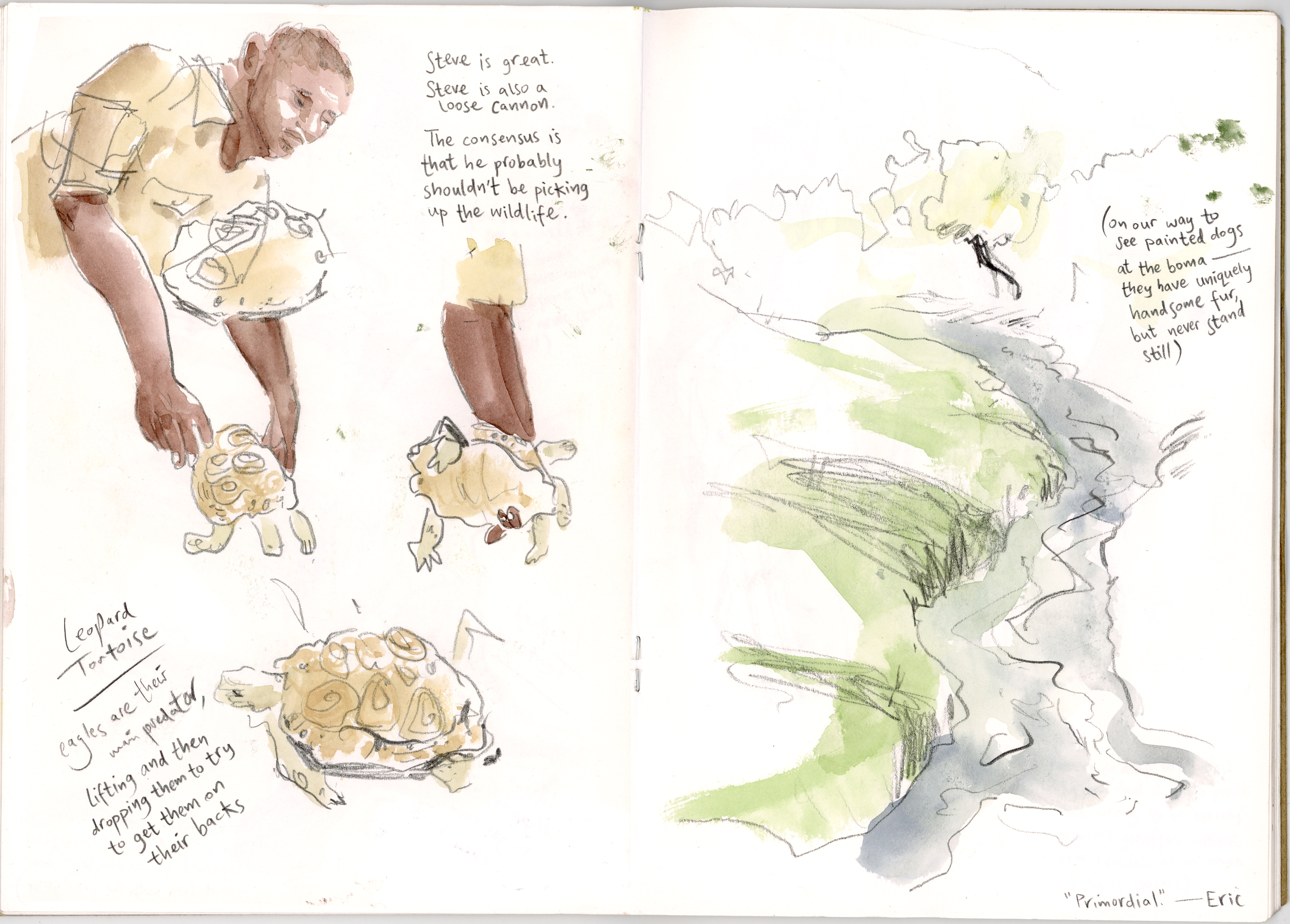
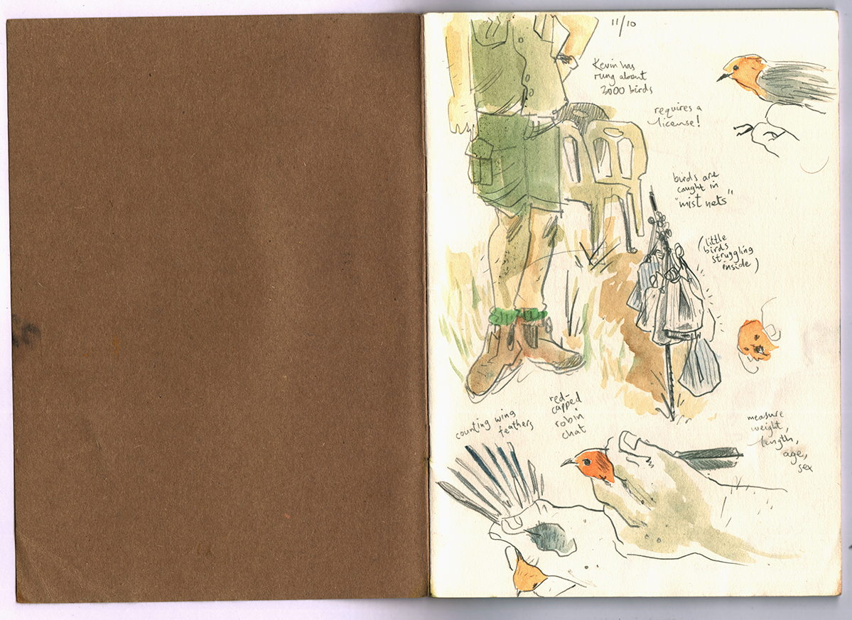
Filed under: drawing, drawing theory, illustration, illustrations, sketchbook, writing | Tags: art, children's books, draw daily, drawing, illustration, sketch, sketchbook, sketchbook inspiration, sketching, south africa, travel diary, travel sketchbook, travelogue, watercolour
(Cross-post with Wild Tomorrow blog.)
In 2023 I was asked along on a volunteer trip for conservation with Wild Tomorrow. At the time, I hadn’t heard of Wild Tomorrow and I confess: I had no idea what I was signing up for.
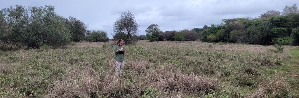
I’m an illustrator and a bit of a writer, and was set to go to the wildlife reserves of KwaZulu-Natal in the east of South Africa for two weeks as part of CBCC (Children’s Books Creators for Conservation, founded just this year by Hayley and John Rocco), ostensibly with the aim of conducting visual research in sketchbooks for a potential book about the subject of wild animal conservation.
Being kind of travel-phobic I approached the trip with some uncertainty. What would these two weeks involve, really? I wasn’t sure. We were provided with an itinerary, which detailed the facts of the unbelievable things we would be doing each day, but these things seemed so far away: what did they really mean?
Sat behind a computer screen in drizzly England, it was hard to think of more than a tourist cliché of ‘go to place, see animals, be amazed.’ And I was worried that I might not be amazed enough, that my heart might not be able to go somewhere so big.
Before this year, I had never had any intention of going to South Africa or seeking out the famous animals of the country, and I’d certainly never been on a trip of this sort. So the opportunity came without preconceptions, and without any notion of what I could contribute, or what I could take from the experience.
This feeling continued even after touching down in Johannesburg and meeting all the lovely, enthused people I would be spending the next two weeks with. ‘Everyone else seems to know what they’re doing here,’ I thought to myself, ‘And I’m not sure that I do.’
But as the days went on, I found myself gradually overwhelmed by the strange new life that Tori and the Wild Tomorrow crew invited us into. In spite of my own hang-ups and misgivings, the country and its people began pulling me into their world, and by the second week, my mind and my heart had been blown wide open, and in time, I began to understand why I was there.
I wasn’t the only one. In conversations with others, I heard similar concerns: being unsure if coming on the trip was a constructive thing, and whether one had something to contribute to the group effort. I guess it’s more natural to have these doubts than I realised. But the doubts we had began to be overtaken by the undeniable optimism of what we were involved with.
Though I had begun the trip hidden behind my sketchbook, my immersion in the place became such that by the first weekend I neglected to draw for a couple of days, stunned and simply taking it all in and enjoying getting to know everyone.
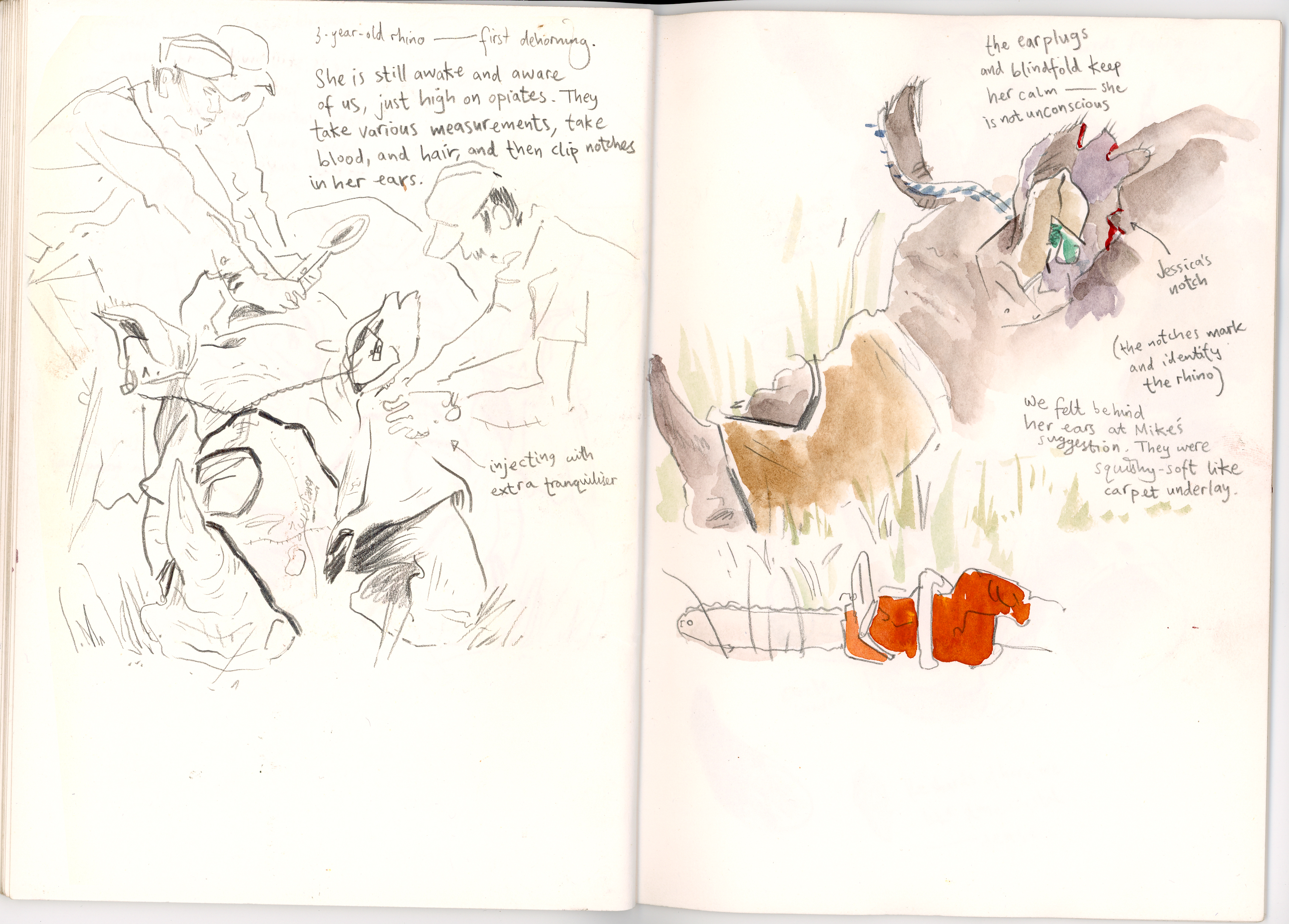
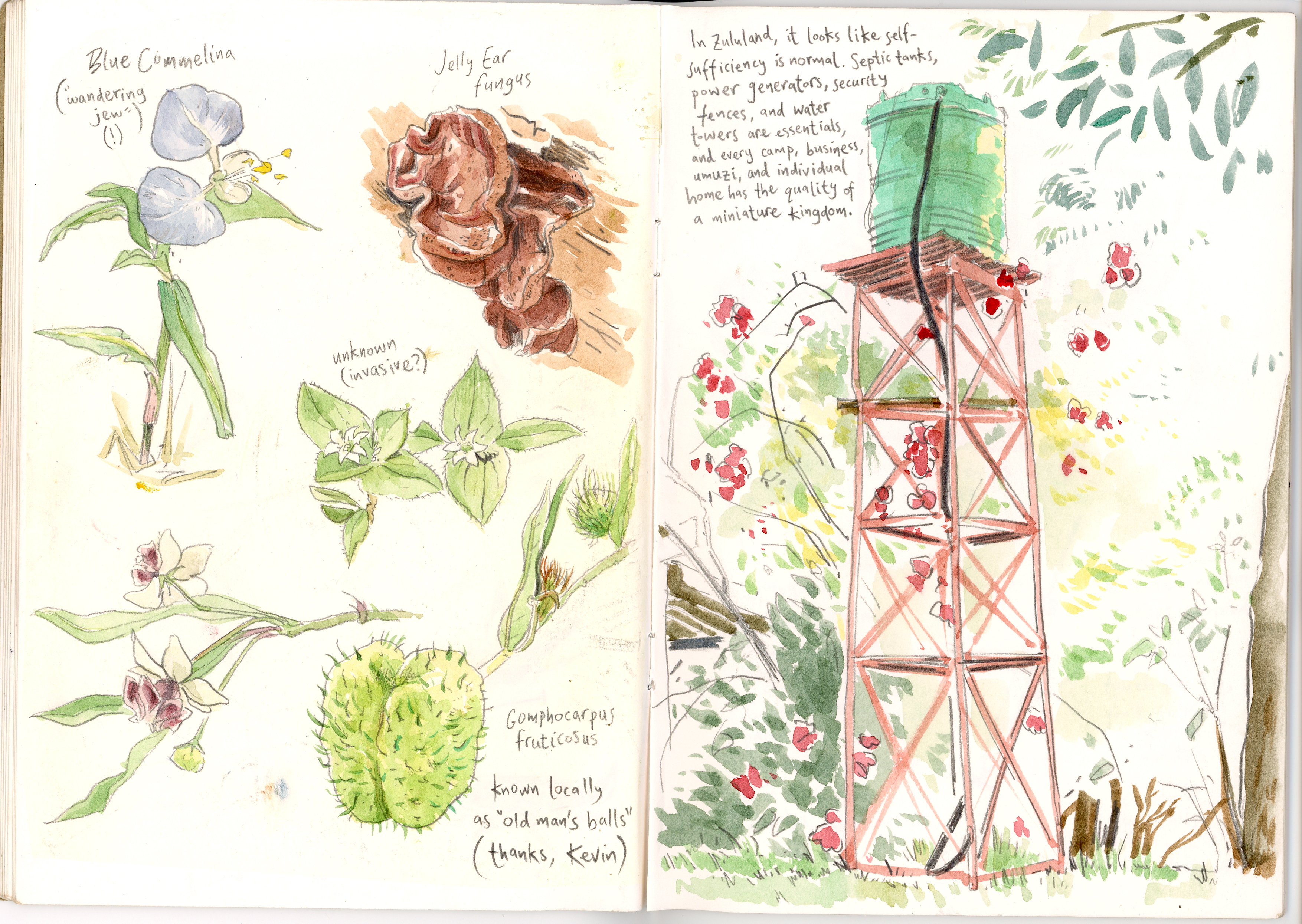
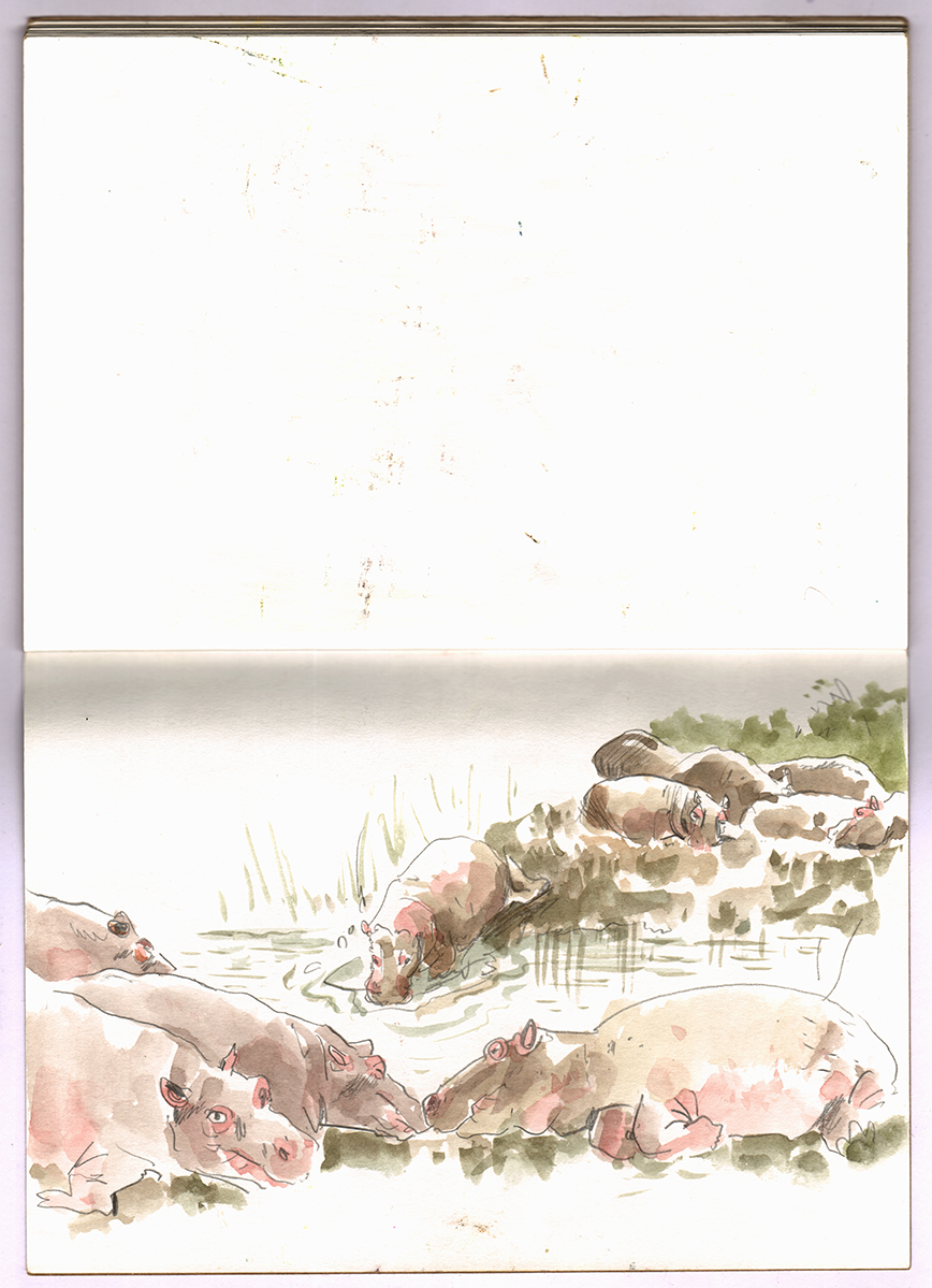
But then, remembering the intended purpose of the trip, I returned to my drawing and note-taking with a renewed vision: that I could use the sketchbook to communicate my emotional and totally subjective experience of the beauty and importance of the threatened natural world, as well as the people working to protect it.
Compared to the tireless work of those who wake up every day and go out there on this mission, I do have to wonder what small part my abilities can contribute to the cause of conservation. But when I experienced the response people had to my drawings, I began to understand the importance of communicating experience, and that there can be something specially significant about a drawing or a very personal piece of writing.
I was even more fortunate to be travelling with fellow book creators as part of CBCC, and had the companionship of sketching alongside wonderful artists like Eric, Brian, and Jessica whose talent and experience and generosity of spirit were both humbling and an inspiration.
‘If I went in to this with a hamfisted idea of what conservation meant’, I thought, ‘Maybe other people have the same unclear or stereotypical vision of all this, and maybe I can share some of my dawning understanding with them.’
Can a drawing capture something that a photograph or a video can’t? Again and again people told me, yes, it can. Drawing opened up conversations with rangers, landowners, vets, locals, and fellow tourists from all over, and what wonderful conversations they were: driven by their love and awe for what was in front of us, a love and awe that they helped me to discover too.
I guess there’s a being there in drawing that people respond to. Someone asked me, ‘Why not take a photograph and draw it later?’ But that would only be drawing animals. And going into the experience, I had worried that drawing animals was all it would be.
But being there, and being a part of it, mattered. From people’s kind and open responses to what I was doing, I learned that by being there I could do much more than simply draw animals: I learned that I might be able to articulate something of how it feels to be there, in the trees where an elephant has fallen, to feel her heated breath, the pulse in her ears, the texture of her skin. And the mood, the tension, the atmosphere. And the determination and care of the people who do this work.
I see art as a way of communicating things that can’t be described in the ordinary ways. There are things we can feel and see that defy simple description, and we saw these things every day. I like to think that this is why poetry exists, to give us the means to articulate feelings that can’t be articulated.
I just hope that a little something of my appreciation for the dignity and vulnerability of these animals and these people, and these places, can come across in my drawings enough to inspire others to feel something of the understanding that dawned at these moments of intensity.
It would be tempting to tell everyone to go buy a ticket right now and hotfoot it to KwaZulu-Natal for two weeks with Wild Tomorrow (and if you’re an artist, a photographer, a poet, or simply a dreamer, then you should consider it if you can), but I also took away a broader message.
We go through many things in life, and each of us lives a different life. There are places you will go that I never will. You may live most of your life in a faraway city I yearn to visit but never will, with your own dreams and fears, ecstacies and heartbreak. We can each only live one life. But by keeping our eyes and our hearts open, and by making art in any way we can, I hope we can let each other in to our own subjective experiences, and see a little bit through each other’s eyes, and live a little bit of each other’s lives, and capture some essence of the fleeting moments in time that make us who we are, and finally understand one another.
Although I went in as a clueless bystander, unconvinced that I had the spirit to rise to the experience, I found myself deeply moved by the things that the people at Wild Tomorrow worked tirelessly to make us a part of and by the glimpses that I had of the lives that go on there. My simple little sketchbook was merely a tool that helped to make this connection happen.
I still need to figure out how to develop all this into something that can contribute to Wild Tomorrow and the wider cause of public communication of conservation issues which is the mission of CBCC. But just going, and being there, was overpoweringly positive, and, I hope, the first step in something very good, and one of the most enriching and fortunate experiences of my life as an artist.
(Photos courtesy of Greg Neri and John Rocco.)
Filed under: comics, drawing, graphic novels, writing | Tags: adult comics, art, award, comics, drawing, first graphic novel award, graphic novel, graphic novels, line drawing, writing
My comic The Infinite Benefits of Shame was shortlisted for the First Graphic Novel Award this weekend at Thought Bubble!
Congratulations to my fellow shortlisters:
Florrie by Anna Trench @anna_trench
The Hiraeth Club by Gareth Cowlin @garethcowlin
Mrs Thorwald by Cathy Brett @gingerdoodles
Zayani Zam by Mereida Fajardo @m.ereida
The Noisy Valley by Myfanwy Tristram @myfanwytristram
Bone Broth by Alexander Taylor @azbtart
Whoever wins, it’s an incredible recognition to have been chosen from among so many entrants and I’ve been humbled by the quality of the other entries.
All of you, who are making personal and deeply-felt work in this ludicrous artform, in this country, in these increasingly-difficult times: you are already winners in my eyes and I love you all for doing what you are doing.
Thanks to the lovely Khadija Osman @k_o_writing and Corinne Pearlman @corinnepearlman for putting together and attending the table (and for the rum)!
And thanks to Chloe Green @okaychloegreen, James Spackman @blackpooltower01 and Zara Slattery @zaraslattery for announcing the shortlist.
Thank you to the judges (and champions of comics): Steve Marchant (plus everyone at @thecartoonmuseum), Emma Hayley (plus everyone at @selfmadehero), Corinne Pearlman @corinnepearlman, comics critic Ayoola Solarin @immortanayo, graphic novelist Sabba Khan @sabbakhanart, artist Mark Wallinger @mark_wallinger_mark, and Alex Fitch at @panelborders for seeing potential in my work.
Plus thanks to @alcs_uk and James and everyone at @bksagency for all they have done to sponsor this award and put it together.
The winner will be announced at Waterstones Piccadilly on Monday 11 December 2023.
Tickets available at Eventbrite.
Filed under: drawing, drawing theory, sketchbook, south africa | Tags: art, drawing, illustration, sketch, sketchbook, travel, travel diary, travel drawing, travel journal, travel sketch, travelogue
I’m not very good at talking.
The idea of going on a trip where I would be with a large group of mostly strangers all day long for two weeks fills me with anxiety. This October I did just that, travelling to KwaZulu-Natal in South Africa with CBCC (Children’s Book Creators for Conservation) to work with Wild Tomorrow.
I have much to say about the work of the conservation groups we met and the value of art and books and public communication in helping to tackle the considerable issues facing our natural world, but my initial surge of feeling and thought regards the people I got to know in South Africa and the power of drawing in real life.
I didn’t prepare adequately for the trip.
I had a fairly profound anxiety response to the upcoming trip and the emotional and social demands it would make. My response was to shut out these demands and refuse to think about them. As it approached, I seriously considered cancelling the trip several times.
I decided that to cope I would use my sketchbook as a shield, a place to hide my eyes, something to busy my hands. Maybe I could hide myself behind that sketchbook for two weeks.
But then something else happened.
The sketchbook, rather than becoming a wall, became a window. Rather than a way of avoiding communication, it became a way of communicating.
To my surprise and profound joy, my travelling companions, rather than seeing my drawing and note-taking as something antisocial, saw it as a direct communication of what I was seeing with my own eyes, and what I was feeling and thinking.
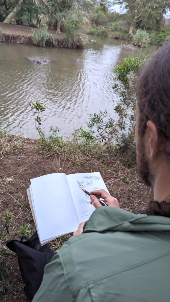
It was as if by drawing, I was opening a dialogue with people.
Throughout the trip, not just artists, but all kinds of people approached me by using my sketching as a way in. How many people feel comfortable complimenting a complete stranger, ordinarily? But when you draw, people do. They smile and they like you. They laugh if you’ve captured a drawing of someone they know. They talk about their own creative projects, or their children. It’s like they see something of your naked soul, and feel they can trust you.
My kind and generous companions in CBCC told me with a frankness I’m not used to that my drawings enriched their own experience of the journey. Many of them are artists themselves, and of vastly greater talent and experience than me, so to have felt that I could contribute to their experience in my small way is nothing short of a blessing.
Drawing my experience of things allowed me to engage with what was happening in a way I couldn’t have without drawing. And not only that, it allowed me to share my experience of things with others.
And people understood.
I underestimated how open and authentic people can be when you reach out. I didn’t really know how to reach out, but I discovered that you can do it with a drawing as much as with speech.
As the trip went on I found myself regretful only that I hadn’t done more in advance to get to know the people and the places I would be going to, and to contribute to the good-hearted work that Wild Tomorrow and CBCC are doing.
I hope that this is just the beginning for CBCC led by Hayley and John Rocco, and for my relationship with them and all the other wonderful people involved.
I started listing everyone to thank, but there are so many that I am bound to miss someone out. Just know that if I met you in the past two weeks: thank you. The kindness and spirit and generosity of you all has been one of the great privileges of my life to experience.
Please consider donating to Wild Tomorrow at: wildtomorrow.org/cbccdonate
Filed under: dino detectives, my antarctica | Tags: antarctica, art, cartoons, children's books, documentary, graphic novels, illustration, picturebooks, science
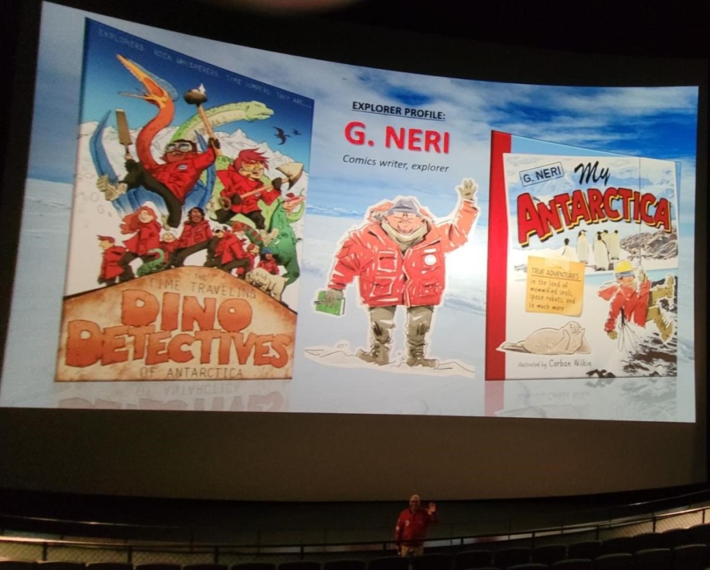
My Antarctica hardcover releases March 2024!
This is the first picturebook I’ve illustrated, and it’s actually a 100-page travel diary. So maybe not a picturebook at all. Or maybe a picturebook like no other.
The ever-wayfaring author of the book, G. Neri, got to see both of our Antarctica books up on the big giant screen ahead of the Houston Museum of Natural Science showing Dinosaurs of Antarctica, the sister documentary to our book Dino Detectives, in their Giant Screen Theatre.
Pre-order My Antarctica in the USA from Amazon, Target, or ThriftBooks.
Pre-orders in the UK currently only from Amazon, but watch this space.

Filed under: sketchbook, south africa | Tags: art, children's books, sketchbook, south africa
In a couple of months I’ll be joining some great writers and illustrators as part of the Children’s Book Creators for Conservation @cbcc_wild on a trip to South Africa to learn about wildlife conservation in the area, from the perspective of book creators.
I’m planning to spend every free moment sketching with a view to using the visual research for some forthcoming projects.
We’ve started a fundraising effort on behalf of the trip’s organizers at Wild Tomorrow Fund @wildtomorrow to contribute to their ongoing conservation work.
Read our press release in Publishers Weekly.
The writers and artists are all funding the trip ourselves, so all donations go directly to to conservation, and donors will receive news, updates, and postcards from the trip.
Donate at the Wild Tomorrow website!