Filed under: drawing, drawing theory, illustrations, sketchbook | Tags: art, drawing, illustration, life drawing
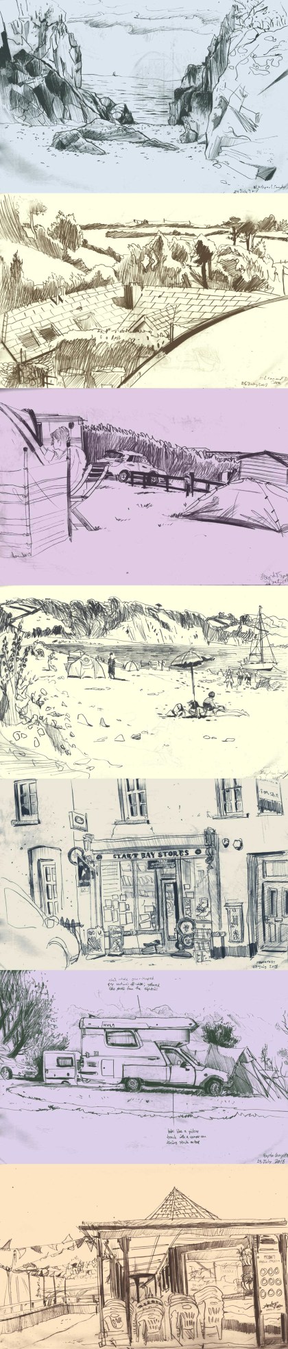
Recently, I took a small sketchbook and a pencil to Devon.
In drawing landscapes and scenes from life I’ve been thinking in terms of ways of handling particular visual elements, i.e. how do you make sense of the world in front of you and actually have your drawing appear immediately to the eye as being the view you were looking at?
You’d think it would be simple. If you just draw what’s in front of you accurately then you’ll end up with a good facsimile of what you were looking at, surely. This is often true with highly skilled impressionistic painters, dabbing carefully chosen colours onto the canvas, and literally getting down what their eyes see until gradually it builds up into a coherent image. But for many types of drawing and painting simply getting down exactly what you see is not enough. More than that: it doesn’t work.
Say you’re drawing with nothing but a grey pencil on white paper. You sit down to draw a landscape. You see an area of bright white sand next to an area of dark rock in shadow. This doesn’t present any real problems. Leave the area of sand mostly white on your page, and make the rocks very dark. But then you look up, and above the sand is the sky. The sky is neither light nor dark: it’s bright. And it’s very distinct from both the sand and the rocks. You’ve already used a light area and a dark area, so do you put the sky down as a mid-tone? That doesn’t really work, it’s too bright. It should be white on the page. But the sand is white on the page, already. So you end up drawing a dark line of pencil to show the line where the sky and the sand meet, even though that line isn’t there in real life. You might even see someone’s lime-green windbreaker or hot-pink parasol against the sand and the sky, and those will have a different quality again.
These are the things I’m trying to find ways to handle when sketching recently. A drawing is not the same thing as real life, and I’m trying to find methods to interpret things so that they communicate on the page. I’m trying to define shapes of certain qualities, colours and textures so that they are immediately distinct. It’s all too easy for a pencil sketch of a scene to devolve into a mess of lines, where everything has the same quality and nothing stands out from anything else, because I’ll have tried to draw everything in the same way, just marking down what I see. But by using defined areas of pattern and tone, and differentiating objects and areas by using varying qualities of line, and by treating identifiable objects as separate and clearly-defined against what’s behind them, I’ve been able to get a lot more clarity than I usually do out of some very simple pencil sketches.
