Filed under: comic artists, comics theory, my comics | Tags: art, cartoons, comics, graphic novels, illustration

Inspired by Alan Bennett’s Talking Heads, Seth’s Wimbledon Green, and a little bit of Irvine Welsh, I drew a comic called The Wonderful Experience straight in to an A4 sketchbook with no planning, character design, scripting or roughing. This is the method Seth used to create the entirety of Wimbledon Green, so I thought I could have a go at a short comic.
Now I’ve tried this sort of thing before; going straight in to finished pages, making the story up as you go along, and my god does it rarely work. Most of the time you get three pages in, declare that what you have done so far is irredeemably awful and is only going to get worse. Then you go away and watch the telly or something. You’re always so inspired when you start out, that’s the sad thing.
Only on two other occasions have I ever completed a comic using this method. In 2007 when I drew a 180-page comic called Wasp and Bee in just five days, and in 2009 when I completed a 24-hour comic called Or, which has since been lost/destroyed, but involved a weird collage of orange and white cardboard and very little story.
This time the ‘no-planning’ method came out fairly well. Although I sort of did plan quite extensively in my head as I got further in to it, but I refused to write anything down. I thought it might ruin the natural flow I had going.
Anyway, it’s a comic about a pitiful character trying to come to terms with his paralysing lack of sexual experience. This is very much me writing from the point of view of a character whom I dislike, but still feel empathy or sympathy for. This is something Irvine Welsh does that I really love, especially with the character of Begbie. He lets you get inside the head of this horrible, violent bastard, and you can’t help but begin to understand his actions just a little bit when you see them from his point of view.
Everyone is the way that they are for a reason, after all.
Click the image to read the whole comic.
Filed under: my comics | Tags: art, cartoons, comics, competition, graphic novels, illustration

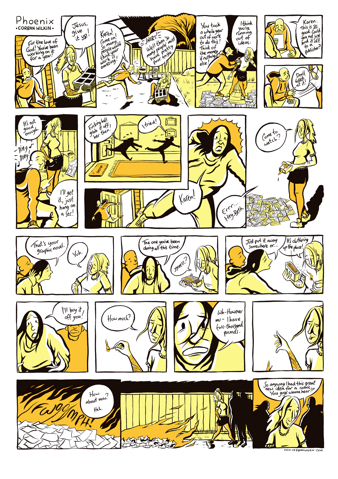
Last year I entered the Thought Bubble festival’s Northern Sequential Art Competition with Phoenix, and above are some panels from this year’s effort, Boundary. Click on the image to read the whole comic.
The aim of this contest is to create a single A3 comics page that tells a complete story, at least six panels, black and white or colour. Sounds simple, but the hard part is getting a coherent story (with a beginning, a middle and an end!) in to one page. My secret? A whole load of tiny panels. Chris Ware eat your heart out.
This one is about a young man who, to say the least, isn’t very well traveled. The drawing style was inspired by David Small’s Stiches, Joff Winterhart’s Days of the Bagnold Summer, and Seth’s Wimbledon Green (which continues, year after year, to be a big source of inspiration). As for authors who are inspiring my writing and storytelling right now, Alan Bennet and Paul Auster are the current big influences. No wonder this comic is so bleak (and listening almost exclusively to The Smiths doesn’t help, either.) It’s undoubtedly a far cry from last year’s entry to the contest both visually and in the tone of storytelling.
Anyway, what am I trying to say here? I hope you enjoy it. That’ll do.
Filed under: my comics | Tags: art, cartoons, comics, competition, graphic novels, illustration

This is a panel from a four-page comic that may or may not be my entry in to the Cape Graphic Short Story Prize that’s coming up soon. I’ve actually finished this one well in advance of the competition deadline, which is a first for me; for the last three years I’ve entered this, I’ve been scribbling away up to the last minute and praying that my entry arrives in the mail in time.
Read the whole story here, in the comics section. I haven’t done loads of short stories lately (i.e. none), on account of working on the graphic novel, but this is a bit of a step up from all my past efforts at short fiction, even if I do say so myself!
I will be working on more stories for the competition though. Lets see if I can top this one.
Enjoy.
Filed under: breaker's end, my comics | Tags: art, cartoons, comics, graphic novels, illustration

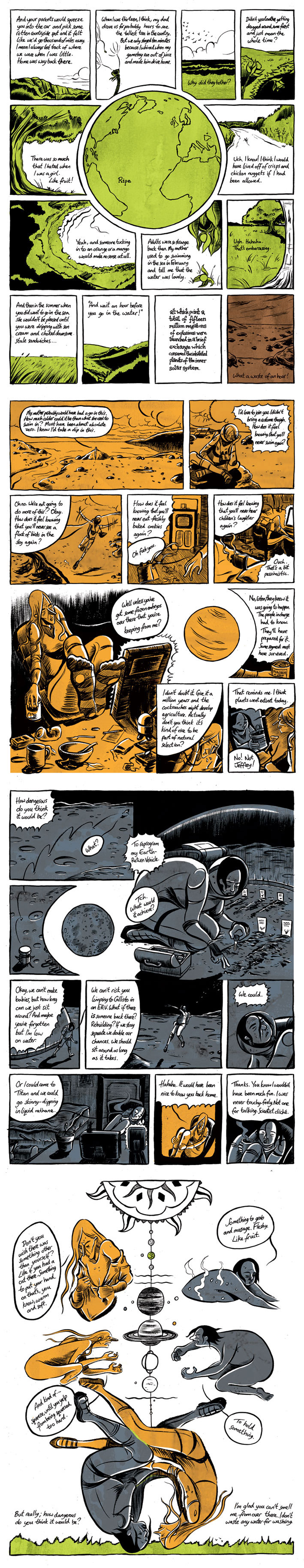
I’m working on several comics right now, with a mind to entering one of them in to the (deep breath) Observer/Cape/Comica Graphic Short Story Prize 2012. This is the competition’s sixth year and the fourth that I will have entered. Last year my entry was an s.f. comic called Ripe which you can read here.
The simple little panel above is from the strip I’m puzzling over at the moment, titled But I Can’t, about two girls who have an obsession with ufos and alien abductions.
What I really love about this competition is that, giving them a real purpose and a definite deadline, it forces a lot of languishing cartoonists to force something out. I suspect that for a lot of entrants it’s the first comic they’ve ever completed, or the first after a long dry spell. It’s a good kick up the bum to start and (wonder of wonders) finish a comic, which is extremely easy to not do most of the time.
The graphic novel (Breaker’s End) is on a brief hiatus, but I’m tantalisingly close to finishing chapter three, and well over half way through drawing the thing. It’s been a heck of a learning experience, this one, and I can’t wait to see it finished two years after first dreaming it up and scribbling out the first draft. Still a way to go yet though, mustn’t jump the gun.
Filed under: breaker's end | Tags: art, cartoons, comics, graphic novels, illustration

It’s been quiet on this blog for some time now since I’ve been focusing all my attention on drawing Breaker’s End, which, after working on it for so long, has reached a sort of critical mass and is being propelled rapidly to completion.
After creating the first chapter for Myriad‘s First Graphic Novel competition last year, I had to spend a long time working on the story and producing a full rough pencil draft of the book, but now I’m fully in to the phase of producing final artwork and in a couple of months, it will be complete.
I’ve taken on a lot of influences for this book, studying other artists and writers closely for the effects and techniques they use, such as David Small’s extremely loose, ragged, and oh-so-powerful linework or the warm, heavy quality of light in paintings like A Philosopher by Lamplight by Joesph Wright of Derby.
I became particularly enamoured with a Monet painting; Towing of a Boat. Squint at the image and you’ll see how he’s created one big, very dark shape on the left which defines the whole image. No matter how much you squint you can still tell what’s going on in this painting, and I realised this should be used more in comics; figuring out what big shapes define the scene in each panel, and then using that to communicate what’s happening in the story.
You can read chapter two and chapter one and a bunch of other stuff in the comics section.
Filed under: breaker's end, comic artists, comics theory, illustrations, my comics | Tags: art, cartoons, comics, graphic novels, illustration

I’m working on chapter two of Breaker’s End at last, and really trying to pin down the right sort of style and aesthetic for the whole thing. I will eventually return to chapter one and redraw it, I think, since it was very much a rush job when I drew it last October.
All the images above from Breaker’s End are work in progress, only half inked with pencil lines still in there, but I quite like them in this state and thought I’d share. Oddly it does seem that sometimes inking a panel or page to completion can kill a lot of the life that was in the pencils. I recently read the graphic novel Local written by Brian Wood and drawn by Ryan Kelly. Kelly’s inking is very heavy and impressive, employing a wide range of techniques to get different effects, but at the back of the book, in a commentary about the art, he said something that rang true with me;
“Usually, my methodology follows something like this: I pencil out a face and it looks great. Then, I ink it and it looks like dook. Finally, I spend an inordinate amount of time nit-picking at the face with white-out, correction tape, and numerous power tools.”
Nevertheless, Breaker’s End is fully thumbnailed and I’ll be working on it steadily throughout the year. It’s shaping up to be quite close to how I envisioned it when I originally dreamed up the idea, so I’m going to keep working at it and see it to completion, come hell or high water.
I’ve also just illustrated three articles for the coming Spring edition of Live magazine, one called ‘Culture Awards’ about upcoming cultural events in 2012. Above you can see a couple of cartoon illustrations for that piece. On my portfolio you can see all the little illustrations for that article plus images for pieces about an agnostic visiting different religious buildings, and Facebook bullying/addiction.
Finally, I’ve been doing some work on a short film called Frank Filleh, about a great man who, working his way through solving all the world’s problems, loses his genius. I’ve drawn images for a magazine and book covers to be used as props in the film.
Filed under: comic artists, illustrations | Tags: art, cartoons, comics, graphic novels, illustration

A few days ago I went to see Craig Thompson in discussion with Marcel Theroux at the St Alban’s Centre in London. He gave a talk about the research and creation process for his book Habibi. The inking style Thompson uses in Habibi is something I’ve been trying to use in my own drawing. He beautifully combines thick and ragged, dry lines with fine little areas of hatching. I’m particularly enamoured with the way he renders trees and rocky cliffs, seen here on the lower-right in a panel from Habibi. On the left is a recent illustration of my own on the subject of technological singularity (predicted to occur in 2045!) which features a cliff in an attempted Thompsonesque style, with the robot atop the peak being rendered more smoothly and carefully. This black and white version really shows the lines nicely, but there’s a full-colour version in my portfolio.
Recently, whilst eating my breakfast, I’ve been copying images from the sizeable collection of art books we have in our house in order to try to learn something by drawing in new ways. Above are a couple of simple Van Gogh studies in fine liner. I’ve never been much involved with fine art (like, I think, most illustrators and cartoonists), but I’ve been growing to love some of the work by those ubiquitous modern masters Van Gogh and Picasso (for Pablo, mainly his early period of work). For composition and line quality, one can find ways of thinking and working that illustrators don’t often use and perhaps find some unique qualities to put in to illustrations. After all, most new developments in illustration spring from developments in the fine art world. Elements of expressionism and impressionism are now widely used in illustration and comics without a second thought, and cartoons themselves seem to me to have been influenced in their course during the 20th century by abstract art and cubism. More than anything, though, one can just learn from the beautiful drawing. Van Gogh’s hard but dynamic outlines are akin to the line an illustrator, working in ink and armed with a brush or nib, might use.
Filed under: comic artists, comics theory, my comics | Tags: art, cartoons, comics, graphic novels, illustration

So that’s two competitions in a row that I’ve entered now, with my entry for the Observer/Comica/Jonathan Cape Graphic Short Story Prize being posted yesterday, special delivery, since today is the deadline (I’m good at leaving these things to the very last minute!). It’s a short science fiction comic about the last two humans, stranded separately on the moons Titan and Callisto, and who can only talk to each other remotely.
It’s called Ripe and you can read it in the comics section I’ve set up. Cast your eyes left, and click ‘comics’ to choose from a selection of my most recent works, available to read in a single smooth column of goodness, rather than the atrocious ‘click link for page one, read, scroll, read, back button, click link for page two, etc.’ format that a lot of blogs present multiple-page comics in. I’ve always preferred a single long column for on-screen comics-reading as it means you can just tap your down arrow as you read, so as not to disturb the flow of the narrative. Scott McCloud, creator of Understanding Comics feels my pain and frequently speaks out against poorly formatted web-comics, especially in this article. Whilst I don’t know if I would word my objections as strongly as he does (from the linked article; ‘The page designs of most long form webcomics suck donkey dick.’) I certainly find myself in agreement with him.
That being said, I know the layout of my comics here could be prettier. Eventually I hope to set up a fancier interface that makes it as clear and lovely and natural to read as possible. Until then though, a single vertical column is a simple yet fairly effective way of creating a decent reading experience.
Regarding the Comica Prize, I found out from an interview I listened to between Paul Gravett and Stephen Collins that the quality of the entries improves every year. The feeling seems to be that a heck of a lot of young people, inspired by what comics can do from reading the new wave of graphic novels (stuff like Blankets, Black Hole, Persepolis), have decided to start taking comics very, very seriously and are set to produce things far greater than anything we have seen so far in this comics renaissance. It means that every year people who enter the Comica Prize are going to have tougher and tougher competition. I hope it drives everyone to new heights in their comics making.
Filed under: breaker's end, comic artists, my comics | Tags: art, cartoons, comics, graphic novels, illustration

A couple of days ago I sent off my entry for the Myriad Editions First Graphic Novel Competition. Above are some images I’ve cut from my comic, ‘Breaker’s End’. Here’s a blurb I wrote for it to give a quick idea of the story:
For ten years, Isaac and Chloe have lived out of a tent in an abandoned woodland. Chloe makes money selling decorated shells, but they are in their sixties now, and sleeping on the cold ground isn’t as easy as it was when they were twenty-year-old backpackers. Chloe would love to live in a warm house and sleep in a soft bed, and when the government introduces a bill to sell off England’s remaining forests and nationally owned land, it looks like living the life of the ‘travellers’ will become an impossibility. Can she convince Isaac, adamant that he will never return to society though he will never explain why? And could she ever hope to earn enough money to live, selling shells by the seashore?
You can see some of the complete spreads over at my portfolio and I intend to upload the first chapter as a whole eventually, in a format that allows you to read it in one smooth column.
Right now I’m composing a four-page comic for the Comica Graphic Short Story Prize which I’ll be displaying here soon. Short stories are difficult to write, but hopefully it’ll shape up pretty well and be a decent entry into the contest.
Good luck to anyone else who’s entering. Last year’s winning entry by Stephen Collins was a tour de force of design and intense short prose. He set a pretty high benchmark; lets hope someone tops it!

I’ve attended various comics-based events over the past week inlcuding the private view of the Cartoon Museum’s follow up to the huge Steve Bell exhibition, an exhibition devoted to Doctor Who in Comics. Above is one of the pages of original art on display, of which there are many by a wide variety of artists. Dave Gibbons and David Lloyd both feature, as well as Alan Moore as a writer. As always, it’s incredible to see pages of original comics art. Very inspiring.
I also attended the Comica Social Club last week, a monthly meet-up at the Southbank Centre hosted by Paul Gravett, who fronts the Comica festival. I got to meet various cartoonists including Jon Lim who draws a webcomic called Vampires from Mars which I think has some incredible cartoon drawing. Also; Claude over at GronkComics has an impressive array of work, including some of the nicest mini-comics I’ve seen (drawn straight into ink in a sketchbook!)
Just last night I attended another meeting of cartoonists organised by The Comix Reader, which also proved to be a decent social gathering of the London comics core. Visiting from Australia was graphic novelist Bruce Mutard, who seems to be a hidden gem of antipodean comics, with a beautiful line drawing style which reminds one a bit of Adrian Tomine.
