Filed under: amy & kay, comic artists, comics, comics theory, drawing, drawing theory, faith in strangers, graphic novels, my comics | Tags: art, art theory, cartoons, comic strip, comics, drawing, graphic novel, graphic novels, how to draw, illustration, making comics, wab sabi, writing
“Nothing lasts, nothing is finished, and nothing is perfect.”
Comics has a spontaneity problem.
Chris ware said that, unlike writing prose or playing music, it isn’t really possible to get into a creative flow when making comics, that the technical demands are too complex and the rate of creation too slow.

The classic way of drawing comics is pretty convoluted. Script, thumbnails, roughs, underdrawing, inking. In fact, almost all comics were traditionally made by teams of three, four, five, or more people all doing their own separate bit to cobble it together.
But what really matters? I care about dialogue and relationships between characters more than anything. Do I care about comics having stunningly beautiful artwork? Well, yes, to an extent. But most of the time, artwork that is too involved, too complex and eye-catching, actually distracts the reader from the story. In a comic, the drawings should be in the service of the story, not in the service of themselves. So when we agonise over every panel, trying to make it a work of art in its own right, we may actually be doing more harm than good.
In trying to find a way to make art without being neurotic about it, I’m making myself work in ways that force me to embrace imperfection. The way I see it, however hard one tries, the result is bound to contain imperfections.
In fact, the acheivement of ‘perfection’ in art is asymptotic, i.e. you can approach it, but never reach it, and as you get closer, exponentially more energy is required to make further progress.
Or in other words: the first 90% requires 10% of the work, and the last 10% of the work requires 90% of the effort.

So maybe it’s better to embrace imperfections rather than engaging in the desperate struggle to overcome them all.
I’m starting to realise that the attempt to iron out all kinks in a piece of writing or drawing is mostly a barrier to progress.
Wabi-sabi is a concept originating from Japan that embraces the transience and necessary incompleteness of anything humans create. Starting from this idea leads one to principles of simplicity and finding natural approaches to creation.
I’m having a go at drawing comics with the most natural approach that I possibly can. Two projects I’m currently working on, my graphic novel Amy & Kay and a daily comic strip Faith in Strangers, are both drawn in pencil without much planning or any underdrawing, and with the intent to embrace imperfection as far as I can bring myself to do so.
When things go right, drawing this way looks more spontaneous and interesting than any laboured-over drawing. When it goes wrong, it’s imperfect, but somehow hangs together with everything else, and balances with the parts that are more successful or complete.
Make the unfinished and imperfect nature of the work part of its essence, like a painting with areas of blank canvas, or a song that cuts off in the middle of the climactic moment.

Filed under: comic artists, comics, graphic novels, illustrations, my comics, politics | Tags: art, books, children's books, climate change, comics, graphic novels, illustration, politics, sci-fi, science
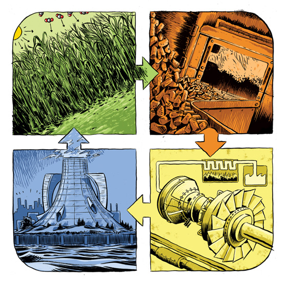
So 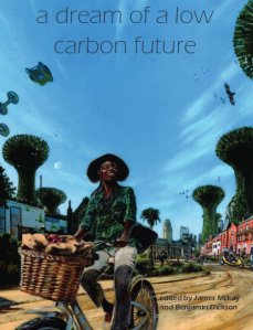 this is just one illustration for an upcoming info-comic-book, pamphlet, public-information type-thing, that I’ve been working on with the Supergen Bioenergy Hub. It shows energy crops being grown to produce bioenergy and reabsorb emissions released by the previous generation of energy crops, ad infinitum. Drawn with a brush and ink, but coloured digitally!
Several other artists have been working on the project alongside me, including the brilliant John Swogger whose blog is extraordinarily active and interesting. Check him out.
More on this project soon. Also, A Dream of a Low Carbon Future, shown in my last blog post, is out in print and digital format.
Filed under: comic artists, comics, graphic novels | Tags: animation, art, books, cartoons, comics, graphic novels, illustration, sketch, writing

My graphic novel project with G. Neri has been in progress for a year now. The end may or may not be in sight, however.
I’m actually now redrawing a number of early pages. I started drawing the book at too-small a size, and I decided I wasn’t happy with it, and reformatted to a weird paper size I’m cutting myself (I’m envious of US paper sizes, since the standard formats we get here in the UK never feel quite right (or maybe I’m just that picky)). So I knew I needed to come back to those pages. Since I’ve had something of a deadline extension, I’m able now to go over some of this huge project and spend a bit more time on what’s be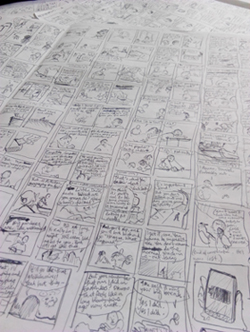 en some truly tricky drawing.
In addition, I’ve been writing a ton of comics short stories, which has been a lot of fun.
Redraughting and drawing them up is a different matter, though. That’s the curse of comics: it’s all so time intensive, but I’d love to find a way to draw my comics quick n’ dirty in a way that works. At least I’m not an animator.
Currently obsessed with: Toulouse Lautrec’s sketches and drawings. He’s very much an illustrator’s fine-artist. Drawings have to have outlines or my puny mind can’t make sense of them.
Also: Scott McCloud’s The Sculptor. Which I’ve read about four times now and may be the most novel-like comic I’ve ever read. Nothing else I’ve seen by a single creator is as successful as this at giving you the scope and depth of a novel. I understand it divides opinion, mostly due to the kitschy nature of the eponymous sculptor-main-character’s art (according The Comics Journal, anyway), and I’d noted that, too, but in book on this scale, there’s bound to be criticisms of some elements. But the thing as a whole: wow, it’s a great comic.
And that’s Corban’s totally-late-to-the-party review.
Filed under: breaker's end, comic artists, my comics | Tags: books, comics, competition, graphic novels

At next week’s Thought Bubble Festival in Leeds (15th & 16th November 2014) I’ll be at the awards night for the British Comic Awards, and I myself have been nominated for the Emerging Talent award. Specifically for Breaker’s End and my work on Dreams of a Low Carbon Future.
Looks like I’m up against some serious contenders though, such as the formidable Rachael Smith and Alison Sampson and… I think I might just be the underdog here.
I’ll be sure to keep all of my various digits and limbs firmly crossed for good luck until next Saturday, which will no doubt increase my chances significantly.
Filed under: comic artists, comics theory, illustrations, my comics | Tags: art, books, children's books, comics, doctor who, graphic novels, illustration, sci-fi, science

Just a piece I neglected to post until now: an ink and watercolour inspired by the Doctor Who episode ‘The Eleventh Hour’, for a big fan of the programme.
The Doctor crash-lands in the back garden of Amelia Pond, and when he leaves, tells her he’ll return immediately. By the time he does get back to her, Amelia’s now a grown woman who’s been obsessed with him her whole life, even though, to The Doctor, very little time has passed. I liked the night-time tone of the greens and blues.
Once again, don’t forget if you’re in Leeds or anywhere nearby, come to the Thought Bubble Festival next weekend (23rd and 24th) and get your free give-away copy of the graphic compendium that is Dreams of a Low Carbon Future, featuring comics and illustration by myself, as well as a mixture of other comics artists, climate researchers, and school-children who have contributed their own work.
Come for the book, stay for the talk on Sunday at 3.50pm with James McKay and Paul Gravett:

Filed under: comic artists, my comics, soft teeth | Tags: art, cartoons, comics, graphic novels, illustration, writing
Of those four new potential graphic novels mentioned last time, I’ve written one as a prose-only novel, one has been ditched like yesterday’s baked beans, and one has been put on the back-burner since I still really want to do it.
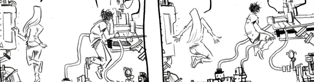
The final one of the four has emerged as the victor (cue sound of cheering crowd) as I kind of knew it always would; which is much to my horror, as this is by far the most complex and difficult of the four. It’s probably going to be about seven-hundred-thousand pages long, and some of the first pages (above) have finally starting spewing from the end of my pencil. More on this as it develops.
Also working on short comics for two very different publications. I still think it’s ludicrously hard to fit a complete story into a few pages of comics. Nevertheless I will attempt to do so. Also it means that every page has to look really good since there’s so few of them. You can’t get by on the sketchy-sketchy hoping that the 300 pages will all support eachother like the sticks in a teepee. It actually has to be GOOD: shock horror.
I have a new cartoonist idol who has inspired me recently despite the great difficulties of writing a long book: Simon Hanselmann. Here’s his Tumblr, Girl Mountain. His main comic Megg, Mogg & Owl/Truth Zone is really worth a look (below). Great character designs, very funny, very deep. Mainly I love how loose and quickly-drawn it is. He seems to dash them off at an incredible rate, and this is particularly what inspired me. Sometimes the best things come out of spontaneity and letting all your ideas and wacky notions come through onto the paper without thinking too much about refinement or perfection. I love that. Also, the witch, Megg, is one of the best character designs I’ve ever seen. She’s ridiculously simple, but so well defined and characterful.
Filed under: comic artists, comics theory, my comics | Tags: art, cartoons, comics, graphic novels, illustration

Inspired by Alan Bennett’s Talking Heads, Seth’s Wimbledon Green, and a little bit of Irvine Welsh, I drew a comic called The Wonderful Experience straight in to an A4 sketchbook with no planning, character design, scripting or roughing. This is the method Seth used to create the entirety of Wimbledon Green, so I thought I could have a go at a short comic.
Now I’ve tried this sort of thing before; going straight in to finished pages, making the story up as you go along, and my god does it rarely work. Most of the time you get three pages in, declare that what you have done so far is irredeemably awful and is only going to get worse. Then you go away and watch the telly or something. You’re always so inspired when you start out, that’s the sad thing.
Only on two other occasions have I ever completed a comic using this method. In 2007 when I drew a 180-page comic called Wasp and Bee in just five days, and in 2009 when I completed a 24-hour comic called Or, which has since been lost/destroyed, but involved a weird collage of orange and white cardboard and very little story.
This time the ‘no-planning’ method came out fairly well. Although I sort of did plan quite extensively in my head as I got further in to it, but I refused to write anything down. I thought it might ruin the natural flow I had going.
Anyway, it’s a comic about a pitiful character trying to come to terms with his paralysing lack of sexual experience. This is very much me writing from the point of view of a character whom I dislike, but still feel empathy or sympathy for. This is something Irvine Welsh does that I really love, especially with the character of Begbie. He lets you get inside the head of this horrible, violent bastard, and you can’t help but begin to understand his actions just a little bit when you see them from his point of view.
Everyone is the way that they are for a reason, after all.
Click the image to read the whole comic.
Filed under: breaker's end, comic artists, comics theory, illustrations, my comics | Tags: art, cartoons, comics, graphic novels, illustration

I’m working on chapter two of Breaker’s End at last, and really trying to pin down the right sort of style and aesthetic for the whole thing. I will eventually return to chapter one and redraw it, I think, since it was very much a rush job when I drew it last October.
All the images above from Breaker’s End are work in progress, only half inked with pencil lines still in there, but I quite like them in this state and thought I’d share. Oddly it does seem that sometimes inking a panel or page to completion can kill a lot of the life that was in the pencils. I recently read the graphic novel Local written by Brian Wood and drawn by Ryan Kelly. Kelly’s inking is very heavy and impressive, employing a wide range of techniques to get different effects, but at the back of the book, in a commentary about the art, he said something that rang true with me;
“Usually, my methodology follows something like this: I pencil out a face and it looks great. Then, I ink it and it looks like dook. Finally, I spend an inordinate amount of time nit-picking at the face with white-out, correction tape, and numerous power tools.”
Nevertheless, Breaker’s End is fully thumbnailed and I’ll be working on it steadily throughout the year. It’s shaping up to be quite close to how I envisioned it when I originally dreamed up the idea, so I’m going to keep working at it and see it to completion, come hell or high water.
I’ve also just illustrated three articles for the coming Spring edition of Live magazine, one called ‘Culture Awards’ about upcoming cultural events in 2012. Above you can see a couple of cartoon illustrations for that piece. On my portfolio you can see all the little illustrations for that article plus images for pieces about an agnostic visiting different religious buildings, and Facebook bullying/addiction.
Finally, I’ve been doing some work on a short film called Frank Filleh, about a great man who, working his way through solving all the world’s problems, loses his genius. I’ve drawn images for a magazine and book covers to be used as props in the film.
Filed under: comic artists, illustrations | Tags: art, cartoons, comics, graphic novels, illustration

A few days ago I went to see Craig Thompson in discussion with Marcel Theroux at the St Alban’s Centre in London. He gave a talk about the research and creation process for his book Habibi. The inking style Thompson uses in Habibi is something I’ve been trying to use in my own drawing. He beautifully combines thick and ragged, dry lines with fine little areas of hatching. I’m particularly enamoured with the way he renders trees and rocky cliffs, seen here on the lower-right in a panel from Habibi. On the left is a recent illustration of my own on the subject of technological singularity (predicted to occur in 2045!) which features a cliff in an attempted Thompsonesque style, with the robot atop the peak being rendered more smoothly and carefully. This black and white version really shows the lines nicely, but there’s a full-colour version in my portfolio.
Recently, whilst eating my breakfast, I’ve been copying images from the sizeable collection of art books we have in our house in order to try to learn something by drawing in new ways. Above are a couple of simple Van Gogh studies in fine liner. I’ve never been much involved with fine art (like, I think, most illustrators and cartoonists), but I’ve been growing to love some of the work by those ubiquitous modern masters Van Gogh and Picasso (for Pablo, mainly his early period of work). For composition and line quality, one can find ways of thinking and working that illustrators don’t often use and perhaps find some unique qualities to put in to illustrations. After all, most new developments in illustration spring from developments in the fine art world. Elements of expressionism and impressionism are now widely used in illustration and comics without a second thought, and cartoons themselves seem to me to have been influenced in their course during the 20th century by abstract art and cubism. More than anything, though, one can just learn from the beautiful drawing. Van Gogh’s hard but dynamic outlines are akin to the line an illustrator, working in ink and armed with a brush or nib, might use.
Filed under: a plague of lighthouse-keepers, breaker's end, comic artists, comics theory, my comics | Tags: art, cartoons, comics, illustration

Drawing comics is a painful process. I wouldn’t recommend it.
My two new comics; After the Protest and Phoenix are now up for reading, and the first is going to be published in the Winter 2011 issue of LIVE Magazine, alongside feature articles about the youth protests and riots across the world that took place over the last year.
Phoenix was my last-minute entry into the 2011 Northern Sequential Art Competition. The competition requires you to submit a self-contained one-page story for an A3 page. I heard about it three days before the deadline, and after many unsuccessful attempts and much head-scratching I came up with Phoenix and did the whole thing in 24 hours.
The theme of the story perhaps says something about how I feel about comics sometimes. I don’t know if other cartoonists have experienced the same urge to burn things that I felt briefly after completing A Plague of Lighthouse-Keepers at the end of four months of work. Thankfully Plague remained intact, but I have destroyed plenty of artwork over the years, and it always comes with wails of protest from friends and family, who insist that one is trashing the Mona Lisa when most of the time it’s actually just a pile of old sketches and juvenile drawings from years before that have no use to you now.
Anyway, that’s not what I’m here to talk about. Instead, I wanted to post a run-down of my current process for creating comics. My methods have varied wildly over the years and will no doubt change again many times, but since Phoenix turned out to be an almost painless comic to create, I thought it would be the perfect time to show the steps I took to create this page.

1. So I dreamed up this idea, a very brief story with three characters in conflict over an action that one is threatening to take because they feel it is in their interests, but which the other characters don’t want to happen. Classic, very simple story structure. So immediately I sat down with a sketchbook and scrawled the thing out, not caring what the characters look like, not doing any real composition, just getting it down as pictures and words. (On the image above the comic starts at the top-left of the right-hand page. I ran out of space on that page and had to continue on the left-hand page.)
2. Being basically happy with the story (which 99% of the time you won’t be) I went ahead and created a full rough. This was done on a single A4 sheet, the panels were all measured, most of the details were put in, words were finalised, but most importantly, this is the stage where the composition is worked out. For each panel and for the page as a whole, I figure out everything like depth, shapes, light and dark, where speech balloons go, how much environment to draw in, etc. Here is where I get everything right, so that I won’t have to make creative decisions when drawing the final artwork.
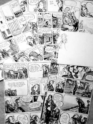
3. I didn’t scan in the pencil layouts, but for the final artwork I measure out all the panels, translating precisely from the rough. This comic was drawn at A2 scale so all measurements had to be doubled. Then I lightly plot the positions of all the big shapes across the page that make up the composition. I draw in detail panel-by-panel next, though I’m not as meticulous about penciling in these details as some cartoonists. I feel more confident drawing with the ink afterwards so that’s when the details really start coming out. I use a size 4 Windsor and Newton Series 7 and completely undiluted Sennelier ink, which is very thick and black and will destroy many expensive brushes until you learn how to clean them properly. So I ink it all up, pretty cleanly in this case, starting with the panel borders, and then basically going from panel to panel. This is the mindless-labour part of making a comic really, but it’s still very enjoyable, especially since you can listen to music or audiobooks because you don’t need to concentrate very hard.
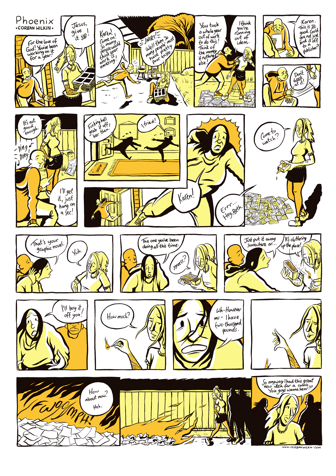
4. Finally you scan it in, blast the contrast so it’s all pure black and white, and then colour it digitally if it’s in colour. Colouring probably doubles the time it takes to create a page, but in some circumstances it’s definitely worth it. I create a new layer over my inks, set it to multiply and then colour away using a pressure-sensitive tablet (I can’t tell you how much nicer it is to colour with than a mouse/pad). For this comic I took an image of fire and selected two colours from the image to use. Taking cues from the duo-tone colouring of Seth, I used these two fire colours the represent all the colour and tone in the story.
Like I said, this is one of the most painless comics I have ever made. Somehow it seemed so easy. Most of the time it’s more of a case of tearing my hair out and constantly thinking that I should try a different story. Sometimes I’ll type out a script to work over, as in the case of Ripe, to try to perfect the dialogue, and usually I’ll have to redraft the initial thumbnail stage countless times.
One of my favourite posts from Craig Thompson’s fantastic blog shows the stages that he went through to create a standard page for Habibi. He actually does five drafts of each page, and they aren’t even in colour! No wonder it’s so good.
P.S. Breaker’s End has been long-listed for the Myriad First Graphic Novel Competition. I’m through the first round!
