Filed under: breaker's end | Tags: art, books, cartoons, comics, graphic novels, illustration, kickstarter, writing
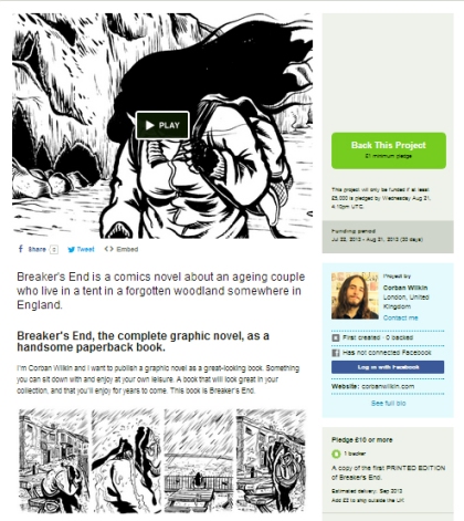
The Kickstarter to fund the printing of my graphic novel Breaker’s End has now begun.
It’s only £10 (or around $18 for US residents) to get a copy of the complete 200-page book, so what are you waiting for? Read chapter one here.
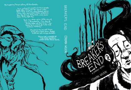
Breaker’s End is about an ageing couple who live their lives in a tent in a dingy forest somewhere in England. Chloe sells paintings and seashells for a bit of money. Isaac wiles away his days playing a tuneless upright piano someone dumped in the forest years before. It’s miserable, but it’s the only life they know. But then the government passes a bill authorising the sale of England’s remaining forests to private interests, and the simple little life they’ve managed to eke out is split apart…
Filed under: breaker's end | Tags: art, cartoons, comics, graphic novels, illustration, writing
That’s right.
On Monday 22nd July, Breaker’s End goes live on Kickstarter, and then we’ve got 30 days to raise at least £5000 to fund the printing of the book for the backers.
This story of Chloe and Isaac living in their shabby forest with an old tent and a piano is one that’s come to mean a lot to me. The artwork is in brush and ink and in the tradition of artful black and white comics of Will Eisner and Craig Thompson. The completed project has come out beautifully. I can’t bear the thought of it sitting in a ring-binder for years to come and neither can you, I’m sure. So I’d like to share it with you, but I need you to get involved.
I worked on Breaker’s End over the course of two years and I really want you all to be able to read a beautifully printed copy of this story. As you’ll know from my earlier posts, the book is completely finished and about 200 pages long and 100% pretty good. All that we need now are your pre-orders so that it can be sent to print!
A printed copy will only be £10, and that includes postage. Once the project makes its funding, you’ll receive your copy within 6 weeks.
I’ll be posting the link for the Breaker’s End Kickstarter page as soon as it’s up. For now, why not read the first chapter of the book here.
Filed under: comic artists, my comics, soft teeth | Tags: art, cartoons, comics, graphic novels, illustration, writing
Of those four new potential graphic novels mentioned last time, I’ve written one as a prose-only novel, one has been ditched like yesterday’s baked beans, and one has been put on the back-burner since I still really want to do it.
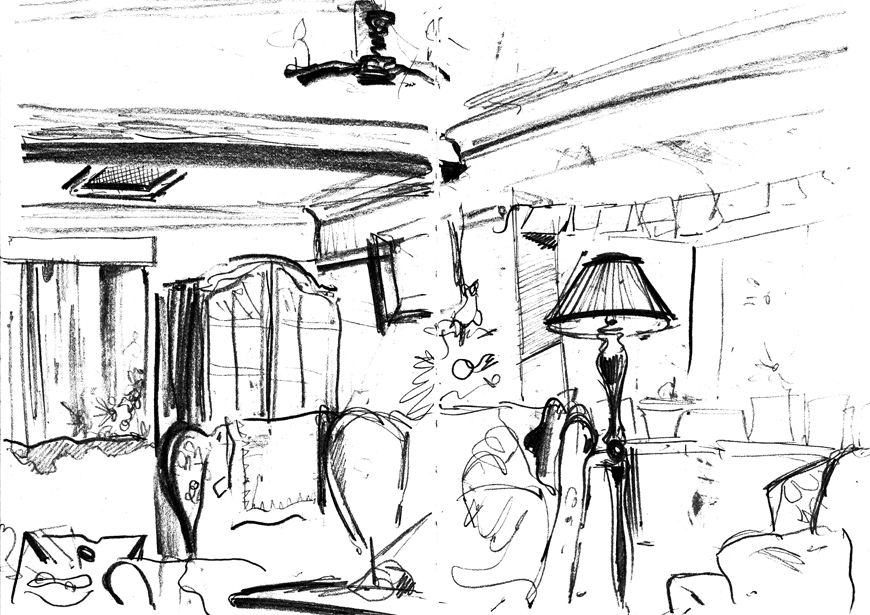
The final one of the four has emerged as the victor (cue sound of cheering crowd) as I kind of knew it always would; which is much to my horror, as this is by far the most complex and difficult of the four. It’s probably going to be about seven-hundred-thousand pages long, and some of the first pages (above) have finally starting spewing from the end of my pencil. More on this as it develops.
Also working on short comics for two very different publications. I still think it’s ludicrously hard to fit a complete story into a few pages of comics. Nevertheless I will attempt to do so. Also it means that every page has to look really good since there’s so few of them. You can’t get by on the sketchy-sketchy hoping that the 300 pages will all support eachother like the sticks in a teepee. It actually has to be GOOD: shock horror.
I have a new cartoonist idol who has inspired me recently despite the great difficulties of writing a long book: Simon Hanselmann. Here’s his Tumblr, Girl Mountain. His main comic Megg, Mogg & Owl/Truth Zone is really worth a look (below). Great character designs, very funny, very deep. Mainly I love how loose and quickly-drawn it is. He seems to dash them off at an incredible rate, and this is particularly what inspired me. Sometimes the best things come out of spontaneity and letting all your ideas and wacky notions come through onto the paper without thinking too much about refinement or perfection. I love that. Also, the witch, Megg, is one of the best character designs I’ve ever seen. She’s ridiculously simple, but so well defined and characterful.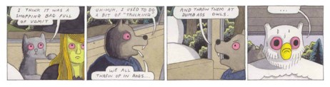
Filed under: my comics | Tags: art, cartoons, comics, graphic novels, illustration, writing
There are several problems associated with writing four graphic novels at the same time which hadn’t previously occurred to me.
For a start it makes each one take four times as long. (Who knew?) Also I have the issue of being able to give up too easily. You see, with just about every comic I’ve ever created, or any project at all for that matter, I usually give up about once per day. It’s sort of an organic part of bringing a project to completion: throwing one’s arms to the sky and declaring that what you’ve done is worthless, telling yourself quite authoritatively that it’s over, you can’t do it any more, before coming back twenty minutes later with a cup of tea and carrying on. Whilst writing four at once, I lose faith in each story just as one of the other stories (inevitably the one which I’ve left the longest without working on) starts to seem like the best idea I’ve ever had.
Now this might sound like a good thing, rotating through the projects, and always working on something, but it begins after a while to seem impossible to focus on one story for very long. If you’ve only got one thing on the go then eventually you’re forced to carry on with it and though you curse and swear and despair and kick the thing across the floor, soon enough the rusty motor kicks into gear and it starts to chug along by itself.
What I’m sure will happen is that one of these stories will begin to take precedence, and as I begin drawing finished pages it will become the only thing I work on, the other stories put on the back burner to be reconsidered at a later date. However, the biggest problem is that that I like I like them all so much I want to see them all come to fruition!
Unfortunately (or fortunately), though, ideas are only worth the time and effort you put into them. Ideas you don’t at least start bringing into being remain as just that: ideas.
I don’t like to discuss subject matter too much until a story’s completed. I tend to always regret telling people my ideas before they are at least at the roughs stage. But I’ll tell you this much about these four in utero graphic novels: one is set in the past, one is set in the very near future, one is set in the distant future, one is set… somewhere very surreal.
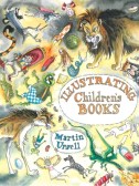
P.S. If you want to be an illustrator but don’t know how to start, you could do worse than getting a copy of Martin Ursell’s Illustrating Children’s Books, which, completely coincidentally, features me as a case study of an illustrator.
Click on the image to go to Amazon and buy it! —–>
Filed under: illustrations, my comics | Tags: art, cartoons, comics, graphic novels, illustration
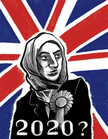
In this illustration for the latest issue of LIVE magazine I’ve experimented with using pencil alongside my usual inks. It’s for an article about the possibility of a non-white British prime minister in the near future.
I’ve also been thumbnailing a new graphic novel project. It’s coming together rather well, story-wise, and it’s going to be a long one. Maybe not Habibi long but far longer than anything I’ve done before. I don’t want to give away any details yet; not even the title, since it’d be a total let-down if I decide not to take this to completion, but when the time is right things will, of course, begin appearing on this blog.
The process of ‘writing’ that first draft is always extremely intense. Once you have the first draft you have the scaffolding: a leg to stand on, but it’s filling those blank pages with the raw stuff of thought, with only research notes to shore you up, that proves to me to be equal parts terrifying and cathartic.

Filed under: breaker's end | Tags: art, cartoons, comics, graphic novels, illustration
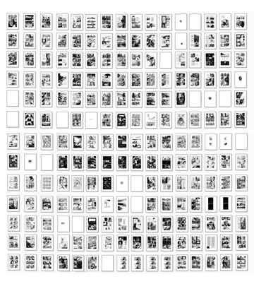
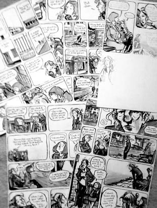
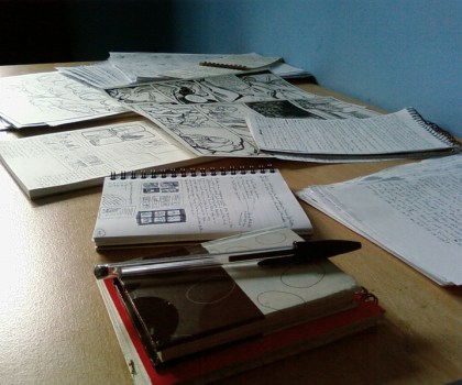
The title says it all. I’ve finished drawing my graphic novel; Breaker’s End. It’s ended up being just over 200 pages long and, even though it really doesn’t look like there are 200 there, you can see every single page in the image above.
Nice to get it done before Christmas and the end of the year. I have two big projects in mind that I want to do next; both very different from Breaker’s End and I want to get started on them as quickly as possible since I’m super-excited about both.
Onwards and upwards.
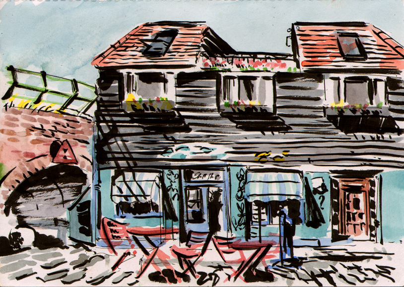
Just found a sketchbook drawing I did a while back of the shell shop called ‘Shell Shop’ that I mentioned in my last post. Drawn back when it was sunny. And below is a drawing from a few days ago of part of Folkestone harbour.

Filed under: breaker's end | Tags: art, cartoons, comics, competition, graphic novels, illustration

A long-belated blog-post thank-you to The Observer, Jonathan Cape and Comica for selecting But I Can’t as the winner of the 2012 Graphic Short Story Prize. I still can’t quite believe I won, actually. It’s incredibly flattering to be chosen in a competition with such great past prize-winners as Joff Winterhart and Stephen Collins. Many many thank yous to all the judges and everyone involved.
Apologies for uttering the cliched admonition of every person who’s ever written a blog, but it’s been very quiet on here lately and I apologise for not posting more frequently, but (there’s always a but) it’s only because I have been frantically working on Breaker’s End; the cartoon sweat beads have been flying out of my head as I’ve furiously scribbled my inky path towards finishing this 200-page book. All I can say is that the drawing will be finished very soon, perhaps in two weeks, and then I can maybe start getting things on paper for the other two, three, four long comics that have been brewing in my addled brain during this last year.
The image above is my collection of shells that I’ve gradually collected and bought whilst drawing Breaker’s End. I’ve got nearly a hundred, including ones I’ve collected on multiple expeditions in Folkestone and Clacton, including periwinkles, limpets, mussels, oysters, hermit crabs, cockles and really big scallops in the middle there. There were about a million of them covering the harbour in Folkestone in the summer, so I went down at low tide and helped myself to five or six. The shells in the basket on the left are much more exotic imported shells I bought from a shop, imaginatively named: Shell Shop.
Below are two of the model heads I made for reference purposes for Breaker’s End, allowing me to get all the difficult angles and to really figure out how the characters look in three dimensions. They are pretty creepy. It might be because they’re bald. Hair is hard to sculpt.

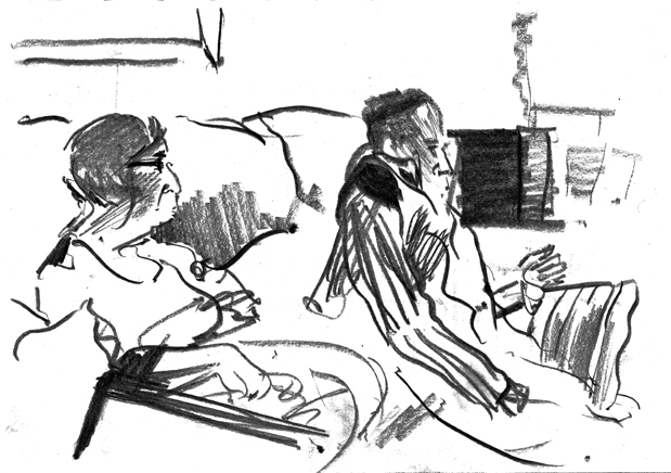
Filed under: breaker's end, illustrations, my comics | Tags: art, cartoons, comics, graphic novels, illustration

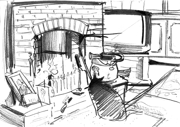
(Click the image for a larger version.) Just a recent scene from Breaker’s End. I thought this one would look nice with a splash of colour. I’m on chapter four of the finished art of the graphic novel now. It’s rather exciting.
